Top Light Color Palettes for Minimalism: Design Guide
The definitive answer to achieving minimalist light aesthetics is pairing high-reflectance neutral backgrounds with low-saturation chromatic accents like pale blues and soft yellows, ensuring maximum whitespace and strict compliance with WCAG contrast standards. When establishing these clean interfaces, developers often reference principles found in building functional light color palettes to keep layouts breathable and uncluttered.
Minimalism works.
Best Light Color Palette for Minimalist Design Principles
Minimalist light palettes rely on high whitespace and low saturation. Background surfaces utilize high-reflectance neutrals like #F8F9FA or pure #FFFFFF. This allows chromatic focal points to guide the eye.

Building a Clean Color Combination of Light Blue
Pairing light blue hex codes such as #E3F2FD with crisp white and off-white backgrounds creates an open, airy digital environment. Aesthetics must not compromise usability.
According to the Web Content Accessibility Guidelines (WCAG), normal text must maintain a contrast ratio of at least 4.5:1 against its background container. To accelerate this process, designers utilize tools like Color Fiind Bloggerr for automated palette discovery and shade extraction.
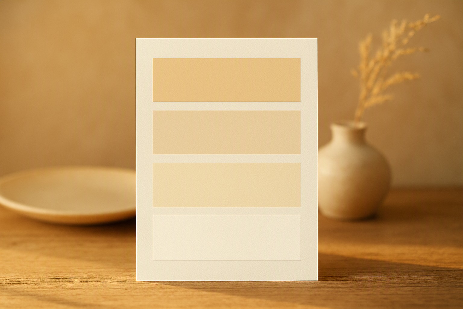
Using a Warm Color Palette Light Yellow
Soft buttery yellows bring warmth to minimalist layouts. They require careful balancing with neutral grays to prevent visual fatigue. When evaluating these schemes against cooler hues in UI layouts, designers look closely at emotional resonance and eye strain metrics.
| Palette Type | Dominant Hex | Accent Hex | Best Use Case |
|---|---|---|---|
| Minimal Blue | #FFFFFF | #E3F2FD | SaaS dashboards and productivity apps |
| Soft Yellow | #FAFAFA | #FFF9C4 | Editorial sites and content reading |
| Sage Green | #F1F8E9 | #C8E6C9 | Health, wellness, and eco-friendly brands |
For broader layout strategies, reviewing our modern light palette framework helps contextualize how yellow tones interact with surrounding typography.
Color Combination for Light Green Applications
Muted sage and mint greens pair naturally with stony grays and stark whites to evoke organic UI patterns and calming environmental psychology. These schemes mimic natural foliage, which reduces viewer stress during extended screen time.
When designing applications that toggle between themes, maintaining cross-theme parity requires analyzing warm versus cool dark palettes to ensure brand consistency across modes, alongside checking our dark mode design standards for structural balance.
Black Light Color Palette Contrast with Minimalism
Inverted minimalist extremes use stark black typography on luminous light backgrounds to create maximum typographic punch. This high-contrast approach has a notable limitation: on modern OLED screens, massive expanses of pure white light can produce glare and accelerate battery drain.
According to the W3C CSS Color Module Level 4 Specification, managing luminance levels accurately prevents perceptual distortion in high-brightness environments.
Sky Blue Color Combination in Airy Interfaces
Gradient-free, flat sky blue accents establish open digital space without adding visual clutter. Implementing a color combination for light blue requires watching out for low-contrast pastel shades that wash out under direct sunlight, a common pitfall explored in evaluating soft contrast limits.
Frequently asked questions
Why are light color palettes preferred in modern minimalist web design?
Light palettes maximize readability, mimic natural paper documents, and create an expansive sense of whitespace that reduces cognitive load. They also align closely with default operating system interface guidelines for day mode.
How do I ensure my light blue and white palette is accessible?
You must test your text and background color combinations to meet a minimum contrast ratio of 4.5:1 for normal text and 3:1 for large text. Tools like the WebAIM contrast checker help verify compliance with official accessibility standards.
Can I mix warm yellow tones with cool blue tones in minimalism?
Yes, provided one temperature acts as the dominant neutral or background while the other serves as a sparse, intentional accent. Overusing both equally can disrupt the serene visual hierarchy essential to minimalist design.


Comments
Post a Comment