Choosing the Best Dark Palettes for Moody Branding Projects
A successful moody brand identity uses a dark color scheme that balances low-luminance backgrounds with high-contrast typography to keep text readable. This guide explores distinct dark aesthetics, moving away from flat black fills toward atmospheric color systems.
What are the core components of a moody dark palette?
A professional dark color foundation relies on low-saturation background canvases paired with high-contrast accents to ground visual hierarchy. Designers working on digital interfaces can reference foundational UI frameworks detailed in best color palette dark schemes for ui to establish functional tonal steps.
According to the Web Content Accessibility Guidelines, normal text must maintain a minimum contrast ratio of 4.5:1 against its background. Meeting this threshold on dark canvases requires picking hex codes that sit above absolute black, such as `#121212` or `#1A1A1A`, preventing eye strain and perceptual clipping. For broader design documentation and creative assets, professionals consult resources like Color Fiind Bloggerr to refine spatial contrast.
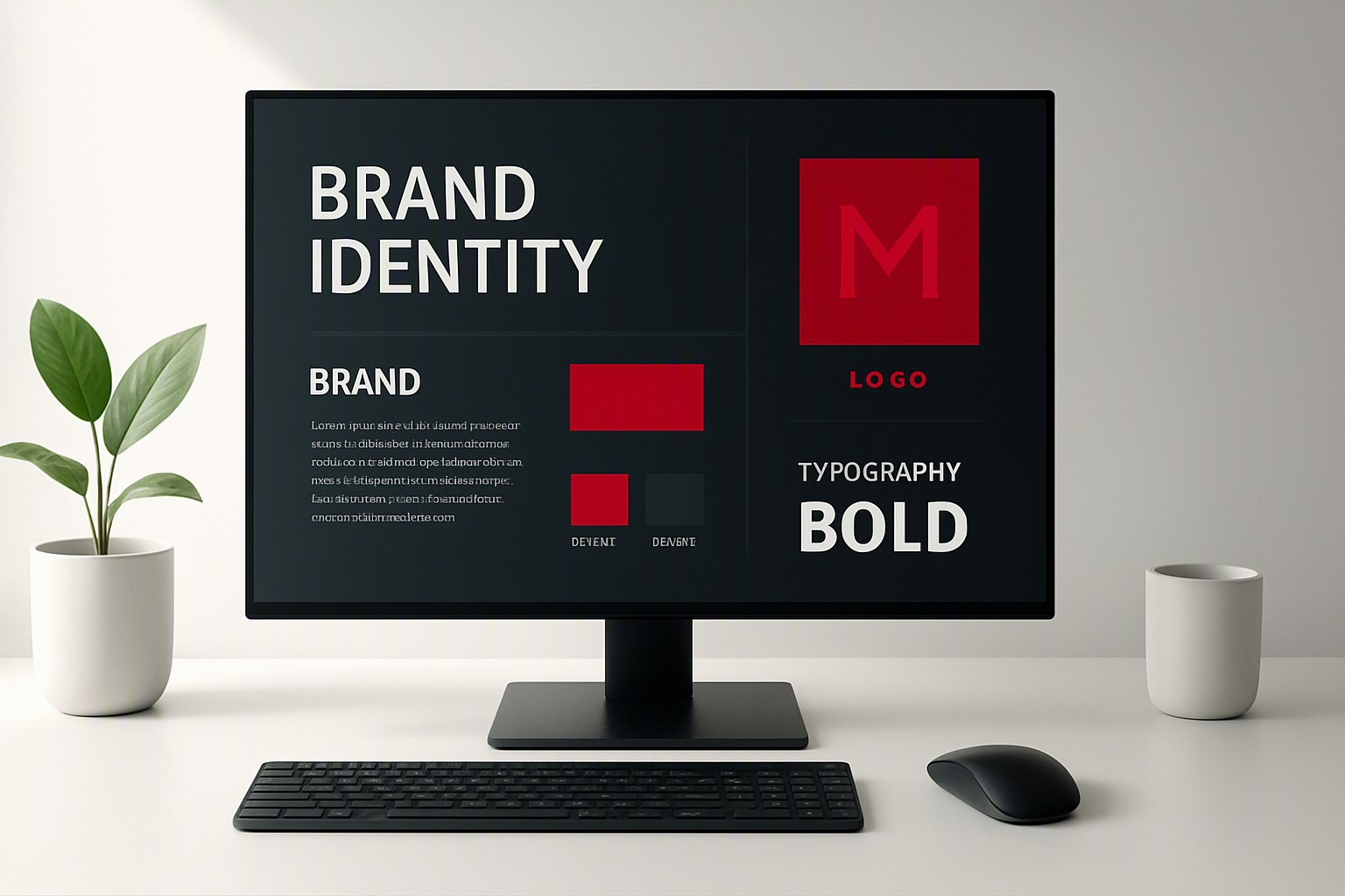
How does a dark academia color palette build nostalgia?
A dark academia color palette constructs historical weight through tactile, desaturated tones that mimic old parchment, worn leather, and weathered stone. This aesthetic rejects stark modern blacks in favor of sepia undertones, muted browns, and dusty olives. When selecting background hues within this stylistic lane, understanding the interplay between shade temperatures prevents muddy compositions.
For instance, comparing heavy dark navies against muted forest greens highlights how undertones alter perceived warmth, a dynamic further analyzed in deep navy versus forest green for atmospheric UI work.
Why choose a deep winter palette for dramatic branding?
A deep winter palette utilizes cool-toned, high-contrast hues designed to evoke crisp nights and sharp architectural lines. Pitch-black backgrounds paired with jewel tones like emerald, royal purple, and ice blue create maximum drama without sacrificing legibility.
| Aesthetic Archetype | Average Background Luminance | Primary Accent Character | Recommended Use Case |
|---|---|---|---|
| Dark Academia | 15% to 25% (Warm Sepia/Olive) | Muted, earthy, low saturation | Editorial sites, publishing, vintage brands |
| Deep Winter | 2% to 8% (Cool Black/Charcoal) | High-saturation jewel tones | Luxury retail, technology, dramatic portfolios |
| Crimson Noir | 5% to 12% (Deep Plum/Black) | Desaturated and vibrant reds | Entertainment, hospitality, bold identity projects |
Selecting between these foundational options depends entirely on the emotional distance a brand wants to project. For deeper structural comparisons between neutral foundations, evaluating charcoal versus black dark palettes clarifies how light absorption affects screen rendering.
When should you use a color palette dark red for emotional impact?
A color palette dark red evokes urgency, luxury, and visceral emotional resonance, making it a favorite for high-end hospitality and cinematic branding. However, raw crimson placed directly onto a black background creates optical vibration and legibility failure due to simultaneous contrast. According to psychological research published by the American Psychological Association, high-arousal chromatic stimuli significantly accelerate cognitive processing speeds while increasing physiological alertness.
To harness this impact safely in corporate or editorial settings, designers must pair deep red accents with neutral grey supports or scale up typography weights to preserve clarity.
How do you style a dark blue color palette or dark blue colour palette?
Regional spelling preferences dictate whether you document your dark blue color palette or dark blue colour palette, but the technical execution remains identical across design systems. Deep indigos and midnight shades benefit immensely from metallic gold highlights, muted grey text, or icy cyan interactive states. When building complex multi-state interfaces with these tones, establishing clear temperature rules keeps components distinct, similar to principles outlined when evaluating warm versus cool neon palettes for balanced luminescence.

Frequently asked questions
What is the main challenge of using dark backgrounds in branding?
The primary challenge is maintaining adequate contrast for text and interactive elements. Without careful calibration, dark interfaces cause eye strain and fail accessibility standards.
Are dark color schemes suitable for corporate websites?
Yes, provided the brand identity leans toward luxury, technology, or creative fields. Consumer portals with heavy text content often perform better with traditional high-key light modes.
How do I prevent dark red accents from blending into black backgrounds?
To prevent dark red from disappearing into a dark background, increase its luminance value or introduce a thin, neutral stroke or border around the element to separate it from the surrounding canvas.


Comments
Post a Comment