Best Color Palette Dark Schemes for UI Design
Dark charcoal (`#121212`) and deep navy blue (`#0F172A`) foundations form the best color palette dark configurations for software interfaces. Desaturated accent colors paired with these shades satisfy WCAG 2.1 contrast rules, reduce screen glare, and preserve clear visual hierarchy across complex application layouts.
Which color palette dark configurations work best for modern app interfaces?
Pure black backgrounds create too much contrast against bright text, leading to eye strain over long work sessions. Dark charcoal and deep navy serve as effective baselines because they soften overall contrast while maintaining readable separation between design components.
At Color Fiind Bloggerr, design principles emphasize calculating exact luminance ratios across stacked UI layers rather than picking random dark tones. Base colors must support multiple card layers, modal overlays, and accent states without losing visual structure.
Compare four proven dark palettes designed for software applications using the table below:
| Palette Style | Base Hex | Accent Hex | Contrast Safety | Ideal UI Application |
|---|---|---|---|---|
| Deep Navy | #0F172A | #38BDF8 | 12.4:1 (AAA) | Data analytics & SaaS dashboards |
| Midnight Charcoal | #121212 | #A7F3D0 | 14.1:1 (AAA) | Content feeds & developer tools |
| Crimson Dusk | #1A090B | #FCA5A5 | 9.8:1 (AAA) | Trading platforms & system alerts |
| Deep Winter | #121E1E | #818CF8 | 10.5:1 (AAA) | Creative tools & mobile applications |
A financial dashboard handling real-time data needs distinct alert states. A reading app requires muted background tones that keep attention on long-form content.
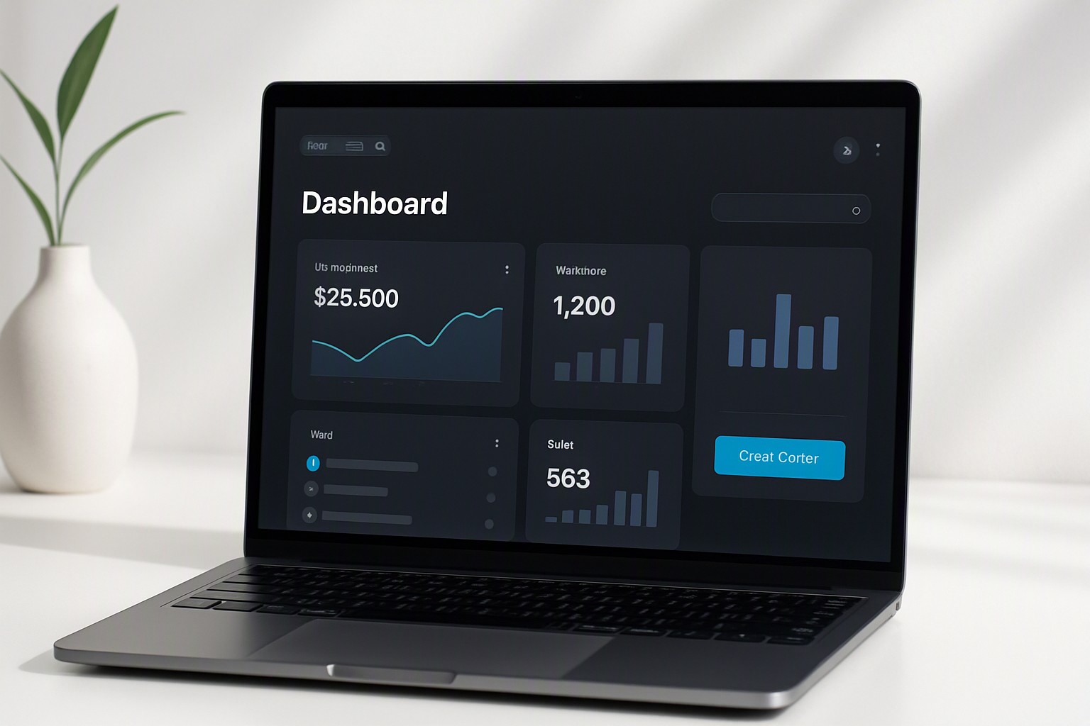
How do you build a dark blue color palette that passes accessibility standards?
A dark blue color palette gives user interfaces a refined feeling while preventing the harsh haloing caused by true black (`#000000`). Deep slate blue absorbs screen glare and provides a natural background for data graphics and white text.
A reliable dark blue palette relies on distinct hexadecimal pairings. Setting `#0F172A` as your background base, `#1E293B` for elevated container cards, and `#38BDF8` as a primary interactive cyan accent creates immediate clear visual structure.
According to the Web Content Accessibility Guidelines (WCAG 2.1), body text must maintain a contrast ratio of at least 4.5:1 against its background color to ensure accessibility for users with vision impairments. Pairing white text (`#FFFFFF`) or light slate (`#F8FAFC`) against a `#0F172A` background achieves a contrast ratio of 15.8:1, passing the AAA requirement.
```
+-------------------------------------------------------+
| Main View Background: #0F172A |
| +-------------------------------------------------+ |
| | Container Card: #1E293B | |
| | Primary Text: #F8FAFC (13.2:1 ratio) | |
| | Accent Button: #38BDF8 (Cyan) | |
| +-------------------------------------------------+ |
+-------------------------------------------------------+
```
Layering cards, modal dialogs, and navigation sidebars in a navy interface requires conveying depth through subtle background step lighting. Applying slightly lighter shades of slate blue as components rise toward the user creates intuitive hierarchy, as detailed in our analysis of light vs dark neon color combinations.
When should you incorporate a color palette dark red theme in dashboard interfaces?
A color palette dark red design style works best in interfaces where immediate visual urgency is required, such as real-time server monitoring, stock trading platforms, or security threat dashboards. A deep crimson base like `#1A090B` paired with a bright red accent such as `#EF4444` draws the operator's focus toward active alerts.
High-saturation red placed across wide surface areas causes optical vibration and quick eye fatigue. Limit vibrant reds strictly to active indicators, status badges, and critical action buttons. The primary background stays deeply muted through desaturated crimson charcoal hues.
Secondary text on dark red interfaces requires neutral grays with subtle cool or warm undertones, such as `#D1D5DB`. Pure white body text on dark red surfaces creates distracting high-frequency edges.
Balance high-intensity alert screens with softer ambient highlights by reviewing techniques for applying top neon palettes for UI design without overwhelming the layout.
How can a deep winter palette inspire rich, high-contrast digital products?
A deep winter palette translates seasonal cool undertones—such as dark evergreen pine, icy slate, deep plum, and cool teal—into stable software themes. These shades provide natural color separation without resorting to stark monochromatic grays.
Effective hex mappings for a winter-inspired UI theme include:
- Base background: `#121E1E` (Dark Pine)
- Surface elevation: `#1B2A2A` (Muted Teal)
- Primary text: `#F1F5F9` (Ice White)
- Interactive accent: `#A7F3D0` (Mint Glow)
- Secondary accent: `#818CF8` (Soft Iris)
Cool undertones reduce visual fatigue during extended screen exposure compared to warm brown or yellowish dark themes. Blue and green wavelengths sit comfortably within human vision sensitivity ranges under low ambient light.
Mapping complex data streams onto cool dark backgrounds mirrors the precise color assignment principles used when designing accessible geospatial heatmap color palettes, where distinct hue steps communicate information clearly.
How does dark UI design impact OLED power consumption and eye strain?
OLED and AMOLED screens light every pixel individually. Displaying pure black (`#000000`) shuts pixels down completely, consuming zero display power for those areas. Displaying dark gray (`#121212`) turns pixels on at low power.
According to Google's Material Design guidelines, dark gray surfaces (`#121212`) save up to 60% of display power on mobile OLED screens compared to light backgrounds, while avoiding the visual artifacts caused by absolute black.
Pure black backgrounds cause a visual effect known as halation, where bright white text appears to bleed or blur into surrounding dark pixels. This effect is especially noticeable for users with astigmatism. Dark slate blues and charcoal grays solve halation by lowering extreme contrast steps to comfortable levels.
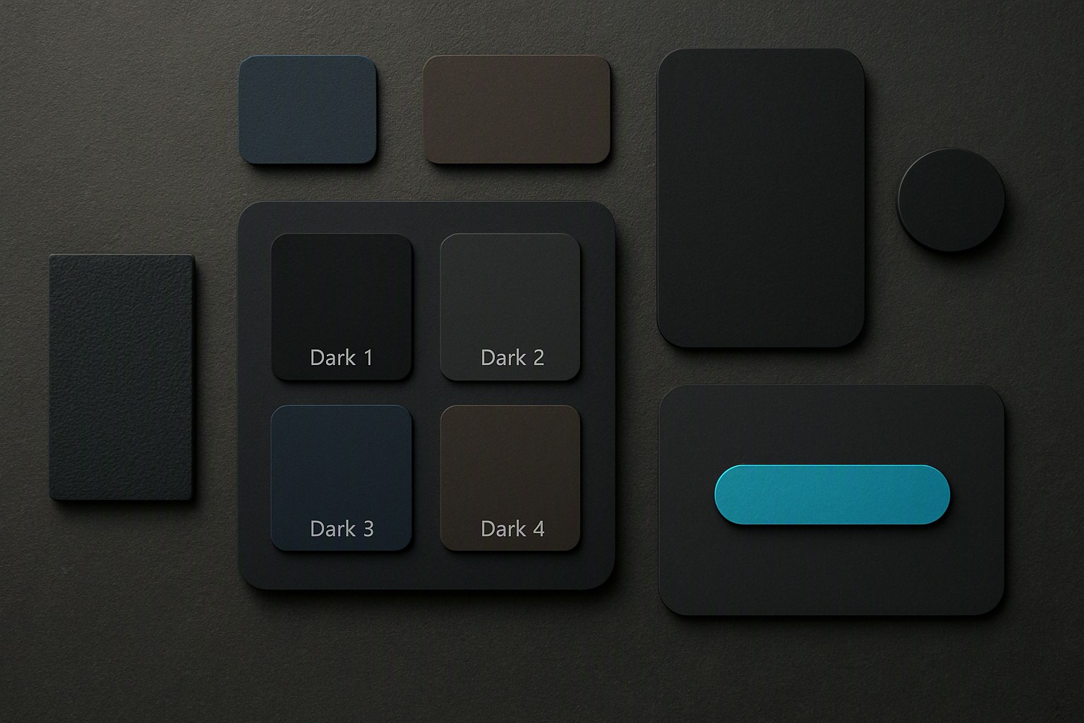
Show elevation in dark UI without using heavy drop shadows by using semi-transparent white overlays over your base surface color:
- Level 0 (Base background): 0% overlay (`#121212`)
- Level 1 (Cards & containers): 5% white overlay (`#1E1E1E`)
- Level 2 (Hover states & menus): 8% white overlay (`#232323`)
- Level 3 (Modals & popovers): 12% white overlay (`#2C2C2C`)
This opacity approach builds scalable depth without distorting background color balances.
Frequently asked questions
Is pure black (#000000) better than dark gray for dark mode UI?
Dark gray or deep navy background colors are generally preferred over pure black (#000000) because they reduce visual glare and eye fatigue. Pure black creates extreme contrast with white text that causes halation, while off-black shades allow designers to express depth and elevation using layered shadows.
What contrast ratio is required for text on a dark UI background?
According to WCAG 2.1 guidelines, normal body text must maintain a contrast ratio of at least 4.5:1 against its background color. Large text (above 18pt or 14pt bold) requires a minimum ratio of 3:1, while AAA compliance demands a 7:1 ratio for standard copy.
How do you choose accent colors for dark mode interfaces?
Accent colors in dark UI should be lighter and less saturated than those used in light themes. Desaturating hues prevents glowing halo effects and screen vibration while ensuring interactive elements remain distinct and comfortable to read.


Comments
Post a Comment