Warm vs Cool Neon Palettes: How to Pick the Right Tone
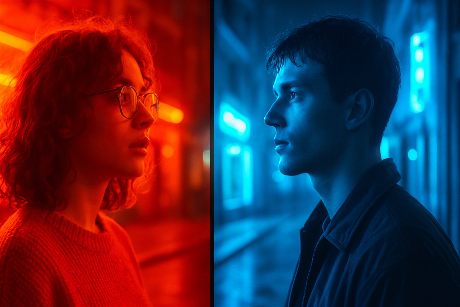
A warm neon palette relies on high-energy reds, oranges, and hot pinks to command immediate attention, whereas a cool neon palette uses electric blues, cyans, and acid greens to project futuristic precision and calm authority. Picking the right temperature dictates how users perceive hierarchy and urgency.
What are the core differences between warm and cool neon palettes?
Warm neon tones are defined by high-energy reds, oranges, and hot pinks, whereas cool neon tones consist of electric blues, acid greens, and bright cyans.
Color temperature heavily influences visual perception and emotional response in digital interfaces, shifting a user's psychological state from alert excitement to focused calm.
Designers often analyze electric blue vs hot pink neon palette pairings to test how these opposing hues interact on dense displays.
When setting up canvases, you must also consider neutral backdrops.
Testing whether is gray cool or warm reveals how background shifts alter neon vibrancy.
A cool gray background pulls warmth out of adjacent pinks, while a warm gray background makes those same pinks feel muddy or washed out.
Understanding warm vs cool gray dynamics ensures your text remains legible against high-luminescence backdrops without requiring maximum display brightness.
When should you use a warm neon palette in your UI design?
High-energy warm neon creates urgency, excitement, or a nostalgic retro aesthetic that works best for promotional banners, gaming dashboards, and media applications.
To help evaluate these choices, the following comparison breaks down the core characteristics of each temperature option.
| Palette Trait | Warm Neon Palette | Cool Neon Palette |
|---|---|---|
| Primary Hues | Hot pink, neon orange, fire-engine red | Electric blue, cyan, acid green |
| Emotional Response | Urgency, excitement, warmth | Precision, calm, technical focus |
| Contrast Profile | Aggressive, high-impact on dark canvas | Crisp, clean, lower eye fatigue |
| Best UI Application | Call-to-action buttons, sale alerts | Data visualization, background panels |
Design standards from organizations like the W3C outline strict contrast ratios for bright neon text on dark canvases.
According to the Web Content Accessibility Guidelines (WCAG), normal text must maintain a contrast ratio of at least 4.5:1 against its background.
When working with bright neon palettes featured in top neon palettes for UI design, achieving this ratio often requires pairing saturated glows with near-black or deep charcoal canvases to prevent visual bleeding.
How does a cool and warm color balance affect visual hierarchy?
Combining opposing temperatures prevents eye strain during extended user sessions by giving the human eye focal rest points.
A common pitfall occurs when intermediate shades feel lukewarm and fail to establish clear focal points, muddying the interface and leaving users searching for actionable buttons.
Maintaining distinct temperature tiers eliminates this ambiguity.
For a practical workflow, creators can adopt strategies inspired by workflows on Color Fiind Bloggerr to structure their asset libraries.
Implementing these steps involves isolating your base hues before introducing accent tones, ensuring your layout respects the principles detailed in our guide on how to build effective color concept strategies.
Following these methodologies, as further expanded in top neon color combinations every designer should keep handy, guarantees that your final interface feels intentional rather than haphazard.
Frequently asked questions
Can I mix warm and cool neon colors in the same interface?
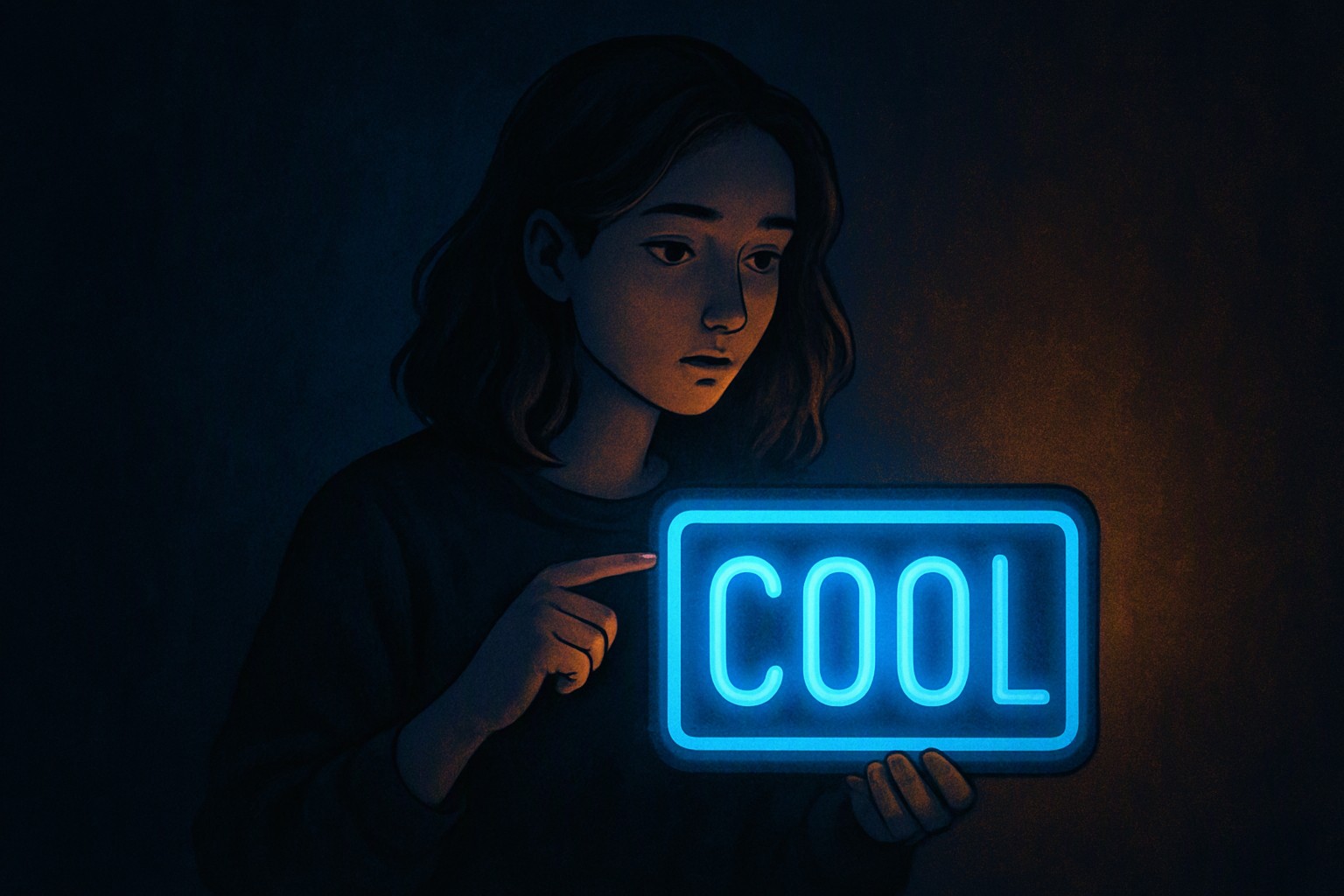
Mixing warm and cool neon tones creates striking contrast, but you must establish a dominant temperature. Using a 70-30 split prevents visual clutter and keeps your user interface accessible.
How do neutral backgrounds affect neon color temperature?
Neutral backgrounds act as a canvas that either amplifies or dampens neon intensity. A true dark gray backdrop allows both warm and cool neons to pop without the blinding glare of pure white.
Why do some neon combinations cause eye strain?
Eye strain occurs when highly saturated neon colors clash against improper backgrounds without sufficient luminance contrast. Adhering to WCAG guidelines for digital contrast helps mitigate this issue.


Comments
Post a Comment