Choosing the Best Dark Accent Color Combination for Your Space
A successful dark accent color combination pairs a low-luminance background with a focal hue that hits a minimum contrast ratio of 4.5:1. This keeps visual hierarchies distinct in physical rooms and digital products.
Selecting the right dark accent color combination
The ideal combination balances background luminance and lighting conditions. Rooms with limited southern exposure or displays viewed in dim environments need careful calibration so shadows do not obscure details. Designers must consult the Web Content Accessibility Guidelines for readability to guarantee text and focal points remain legible against deep backgrounds.
When selecting tones for moody color schemes, follow these rules:
- Pair warm undertones like burnt umber or terracotta with amber or muted gold highlights
- Cool undertones like slate and indigo pair best with icy silver, crisp mint, or electric cyan
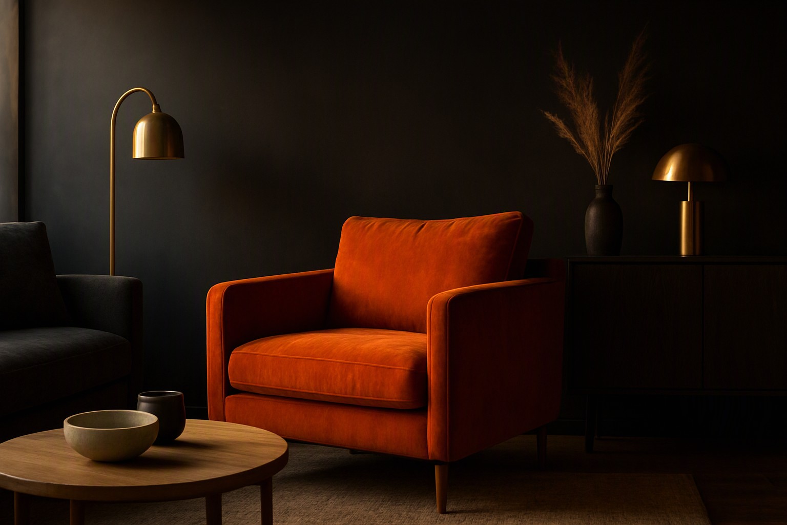
Charcoal versus deep navy for moody shades
Pure black absorbs nearly all incident light, which flattens spatial dimensions and hides architectural joints. Charcoal gray and deep navy blue offer more nuanced light absorption, retaining subtle texture while defining spatial boundaries.
| Shade | Primary Application | Undertone | Lighting Suitability |
|---|---|---|---|
| Charcoal | Accent walls, dark mode UI surfaces | Neutral to warm | Best in bright, direct natural light |
| Deep Navy | Feature walls, brand backgrounds | Cool | Functions well in dim or artificial light |
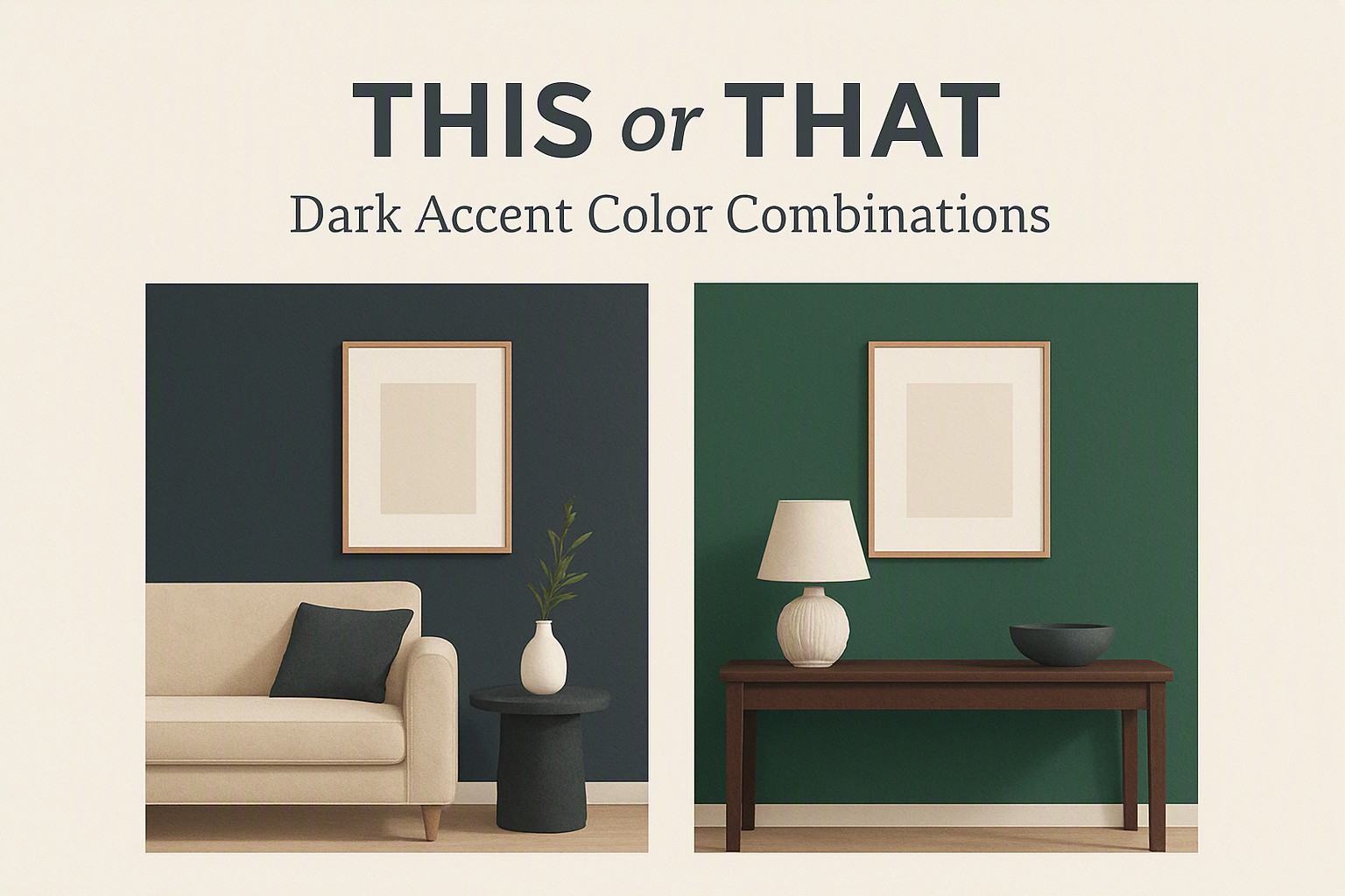
According to Adobe Color design standards, saturated dark hues evoke feelings of security and high focus, but they require contrasting highlights to prevent visual fatigue. When evaluating these options alongside deep navy vs forest green alternatives, consider how ambient room temperature influences your perception of the base hue.
Applying dark accent hues in UI design and interiors
Proportion matters. Adapt the 60-30-10 rule for dark-mode interfaces and interior feature walls by making your dark base occupy 60 percent of the visual field, a secondary neutral or supporting tone take up 30 percent, and your accent color claim the final 10 percent.
Metallic or vibrant highlights prevent dark spaces from feeling claustrophobic by catching and reflecting stray light points. Insights from Color Fiind Bloggerr emphasize that material texture interaction—such as pairing matte paint with polished metal or textured plaster—adds necessary depth to interior accent walls without disrupting the overarching dark color palettes you have established.
Frequently asked questions
Will dark accent colors make a small room look smaller?
Yes. Dark colors absorb light rather than reflecting it, which visually compresses boundaries. However, using them on a single feature wall paired with bright lighting can add perceived depth.
What is the best metallic finish to pair with dark accent walls?
Warm metallics like brushed brass, copper, and aged gold create a striking contrast against cool dark tones like navy and charcoal. Cooler silvers and chrome work better if the dark base has warm undertones.
How do I maintain text readability on dark digital interfaces?
Always ensure your body text achieves a contrast ratio of at least 4.5:1 against the dark background, following standard accessibility guidelines. Avoid pure white text on pure black to prevent eye strain.


Comments
Post a Comment