Top Neon Color Palettes for Cyberpunk Design
The definitive cyberpunk neon color scheme relies on a high-contrast foundation of near-black backgrounds paired with hyper-saturated cyan, magenta, and electric yellow accents to replicate glowing luminescence on digital screens. Building futuristic interfaces or sci-fi environments means balancing extreme vibrancy with deep shadows to achieve visual depth without inducing severe eye strain. Effective implementation requires precise hex code management and an understanding of human vision in digital spaces.
What makes a successful cyberpunk neon color palette?
A successful cyberpunk aesthetic depends heavily on deep dark backgrounds like charcoal or black to make bright glows pop. Pure absolute black (#000000) absorbs all light, but dark structural foundations like deep grays offer better fidelity for subtle lighting shifts, a dynamic explored in charcoal vs black dark palette which. Keep 70 to 80 percent of the composition dark. Reserve hyper-saturated accents for focal points, interactive elements, and primary UI borders. Muted supporting tones such as industrial cool grays or desaturated purples prevent the layout from becoming chaotic while anchoring the glowing highlights.
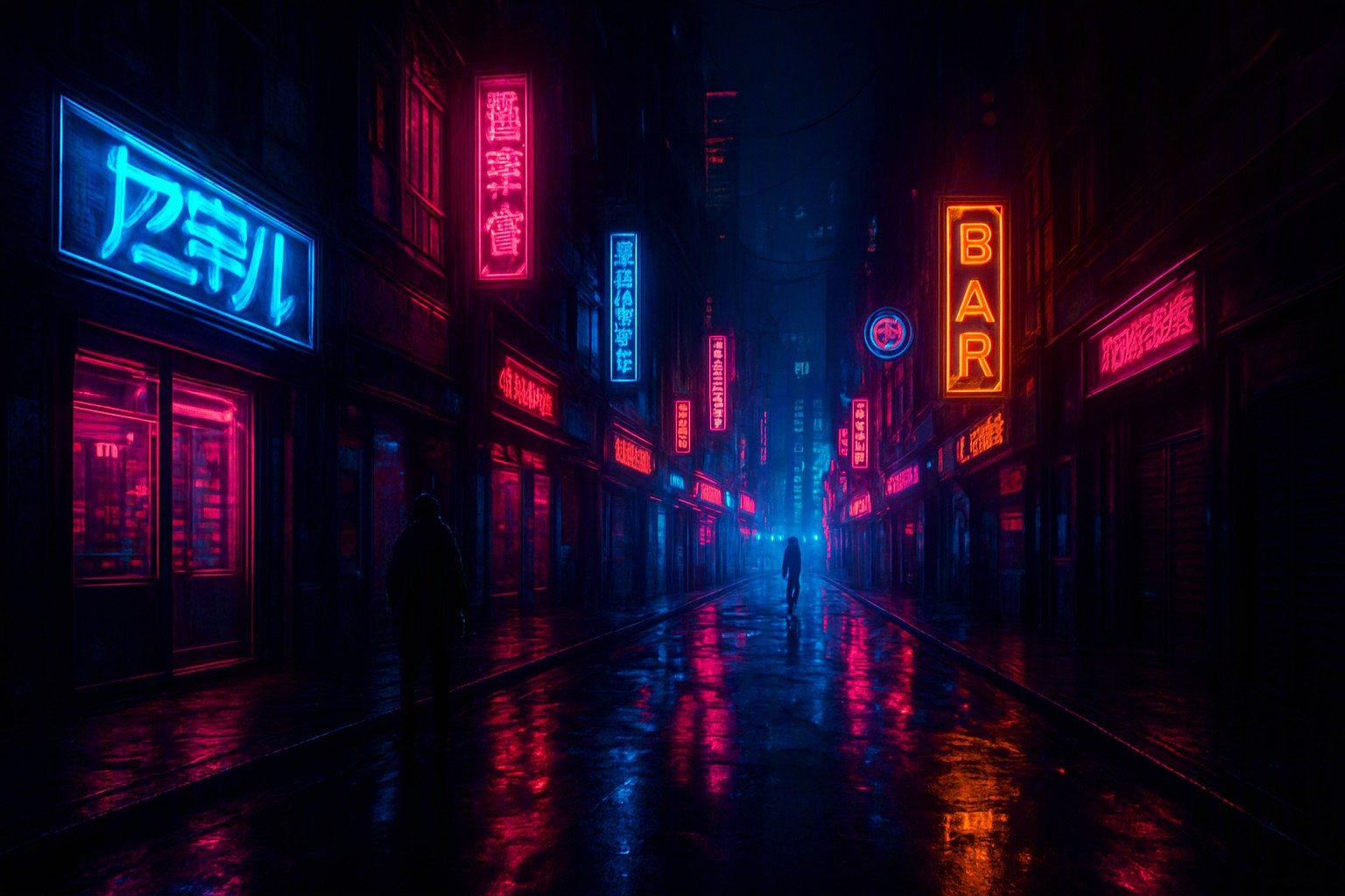
Core elements of an effective neon blue color palette
Building an effective neon blue color palette requires specific hex codes that push sRGB color gamuts to their upper limits. Cyan (#00F0FF) provides the primary ice-cold glow, while electric azure (#0047FF) anchors deeper shadows and UI panels. When paired against hot magenta (#FF007F) or laser pink, neon blue creates the immediate high-contrast tension required for authentic sci-fi environments. According to the World Wide Web Consortium (W3C) accessibility standards outlined in the Web Content Accessibility Guidelines, high-luminance colors demand a minimum contrast ratio of 4.5:1 against dark backgrounds to remain legible for users with visual impairments.
Adapting an 80's neon color palette for modern screens
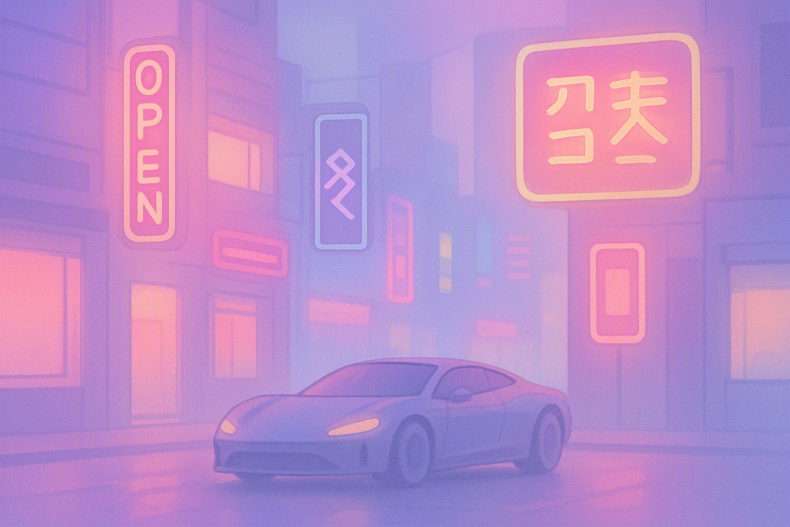
Adapting vintage synthwave aesthetics for contemporary digital platforms requires toning down blinding saturations to meet modern UI usability requirements. Traditional arcade graphics relied on unfiltered, harsh primary hues. Modern cyberpunk layouts utilize subtle gradient meshes and drop shadows to simulate physical light emission. Explore Choosing the Best 80's Neon Color Palette for Arcade Themes to understand how nostalgic pinks and purples translate into clean, responsive web layouts.
Essential neon color palette hex code combinations
Precise hex codes separate professional cyberpunk design from amateur color dumping. High-intensity neon green utilizes #00FF66, hot magenta is defined by #FF007F, and laser yellow operates at #FFEE00. For broader combination ideas and multi-layered UI layouts, reference the curated guides on Color Fiind Bloggerr.
| Palette Variation | Primary Hex Code | Secondary Hex Code | Recommended Use Case |
|---|---|---|---|
| Toxic Urban | #00FF66 (Neon Green) | #111111 (Dark Charcoal) | Terminal interfaces, data readouts |
| Neo Tokyo | #FF007F (Hot Magenta) | #00F0FF (Cyan Glow) | Cyberpunk branding, hero banners |
| Synthwave Grid | #FFEE00 (Laser Yellow) | #7B00FF (Deep Purple) | Retro-futuristic UI highlights |
Frequently asked questions
Why do cyberpunk designs use dark backgrounds?
Dark backgrounds create the necessary contrast to make saturated neon hues appear as if they are actively emitting light. Without deep dark tones, neon colors lose their intense luminescent effect and can cause visual fatigue.
How do I prevent neon colors from causing eye strain?
Pair hyper-saturated neon accents with deep, desaturated background neutrals instead of pure stark white to reduce eye strain. Limiting neon elements to key focal points also keeps interfaces readable.
What is the difference between synthwave and cyberpunk color palettes?
Synthwave palettes lean heavily into nostalgic 1980s sunset gradients with purples, pinks, and warm oranges. Cyberpunk palettes incorporate cooler tech-driven hues like toxic greens, electric blues, and industrial grays alongside hot pinks.


Comments
Post a Comment