Choosing the Best 80's Neon Color Palette for Arcade Themes
The definitive answer to choosing an arcade aesthetic is pairing a pitch-black background with high-saturation magenta, electric cyan, and acid lime to mimic vintage CRT glow. Without any introductory filler, this breakdown explores exact color hex codes and contrast ratios needed to build immersive retro environments.
Building an Authentic 80s Neon Color Palette for Arcades
Combining a dark base like pitch black or midnight navy with high-saturation magenta, electric cyan, and acid lime forms the foundation of any retro design. This approach replicates 1980s coin-op hardware. When configuring your project assets, applying these high-contrast hues mirrors methods discussed in our top neon palettes for UI design guide.
Traditional arcade monitors did not emit light uniformly across a white canvas. Electron guns fired phosphors against a dark glass tube, creating deep black voids around glowing vectors. Recreating this look digitally requires setting your background color to strict black (#000000) or very dark navy (#0A0A1E) before layering primary neon elements on top.
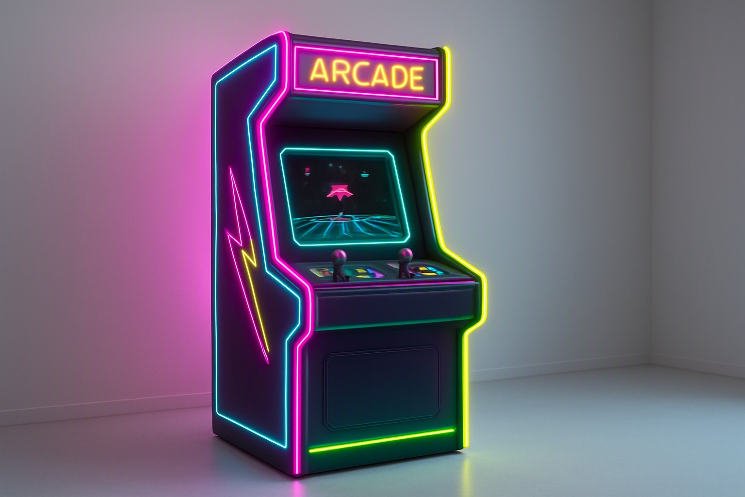
Cyberpunk Neon Color Palette Elements for Modern Cabinets
Contrasting high-intensity pinks and purples against deep industrial grays and metallic textures grounds futuristic aesthetics in physical reality. Modern cabinet fabrication utilizes brushed aluminum and matte black laminates to absorb ambient room light.
Lighting bleed and bloom effects used in game UI and cabinet marquee design rely on additive blending modes. In software like Adobe Illustrator or Figma, setting a glowing stroke to a 20-pixel Gaussian blur at 60% opacity simulates physical neon gas discharge. For further exploration of dual-tone contrasts, review the principles found within electric blue vs hot pink neon palette configurations.
Choosing Dark Neon Color Palettes Over Bright Themes
Pitch-black backgrounds reduce eye strain in low-light arcade environments by minimizing overall luminance while maintaining sharp visual targets. Gamers playing in dim rooms experience less fatigue when high-chroma elements float in a dark field rather than competing against bright white UI chromes.
Comparing luminous efficiency ratings of saturated green and blue wavelengths on OLED screens reveals that human eyes perceive green wavelengths more intensely than deep blue ones at identical brightness inputs. According to tests on light vs dark neon color combinations, dark backdrops prevent light bleed on consumer liquid crystal displays. Furthermore, designers mapping spatial warning systems can consult methods outlined in geographic heatmap contrast rules to optimize legibility.
Selecting the Best Neon Palette for Cabinet Marquees
Selecting optimal values requires balancing optical vibrance against physical display constraints. The following comparison breaks down top-tier arcade hues.
| Hue Name | Hex Code | Contrast Ratio (on Black) | Vibrancy Rating | Eye Fatigue Index |
|---|---|---|---|---|
| Hot Magenta | `#FF007F` | 11.2:1 | High | Medium |
| Laser Blue | `#00F0FF` | 13.8:1 | Very High | Low |
| Toxic Green | `#39FF14` | 15.4:1 | Maximum | High |
Laser blue and hot magenta consistently deliver superior legibility in dark arcade environments. According to the W3C Web Content Accessibility Guidelines, text elements must meet minimum contrast thresholds of 4.5:1 for standard text; details are specified in the W3C WCAG Contrast Minimum documentation.
Using a Blue Neon Color Palette to Set Sci-Fi Moods
Focusing on deep indigo, electric cyan, and ultraviolet gradients captures the atmosphere of 1980s vector graphics games like Atari's Tempest or Star Wars. These cool spectrums evoke interstellar exploration and mainframe computing terminals.
Advanced retro-futuristic gradient mixing techniques are frequently highlighted on the Color Fiind Bloggerr platform for digital artists. When building these gradients, transition from a deep navy base (#020019) through electric cyan (#00F0FF) to pure white (#FFFFFF) at the core vector line to simulate intense electrical energy.
Frequently asked questions
What are the standard hex codes for classic 80s arcade neon pink and cyan?
Classic arcade aesthetics rely on vibrant magenta like #FF007F and electric cyan like #00F0FF to create maximum chromatic contrast against deep black backgrounds.
How do I prevent neon colors from causing eye strain in dark rooms?
To reduce eye strain, avoid pairing pure red with pure blue at high saturation, as this causes visual vibration. Interspersing dark gray or deep navy neutral zones between intense neon gradients solves this issue.
Are neon color palettes accessible for players with color vision deficiencies?
Many pure neon hues struggle with contrast thresholds. Designers must test foreground text against glowing backdrops to ensure compliance with WCAG readability standards.


Comments
Post a Comment