Top Neon Color Palettes and Schemes for Creative Projects
A successful neon color scheme pairs hyper-saturated fluorescent hues with deep, desaturated backgrounds like charcoal or midnight black. This maximizes luminance contrast without causing eye strain.
What makes an effective neon color scheme for modern creative work?
High-saturation lighting simulation in digital mediums replicates plasma displays, gas-discharge tubes, and LED panels by pushing RGB channels to maximum limits.
Designers manipulate luminance values so that vivid pigments appear to emit light rather than merely reflect it. High-chroma colors against dark values act as luminous sources.
According to insights on neutral vs bright balance shared across Color Fiind Bloggerr, balancing absolute black with maximum chromatic intensity prevents compositions from flattening into visual noise.
Dark background contrasts amplify visual vibration by forcing adjacent hues to compete for perceptual dominance. When a saturated pigment touches a deep shadow, simultaneous contrast enhancement occurs at the edge boundaries. This physical reaction heightens perceived saturation beyond sRGB gamut limits. Designers harness this effect carefully to avoid bleeding artifacts on low-quality consumer displays.
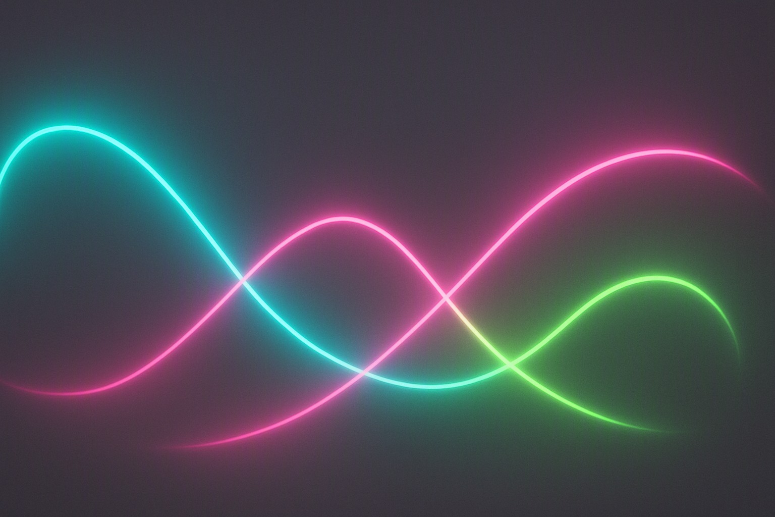
How do you build a high-contrast neon blue color palette?
Constructing a neon blue color palette balances piercing cyan highlights with anchoring dark values to eliminate ocular fatigue. Electric cyan (#00FFFF) provides the primary luminosity peak. Deep navy (#0A1128) and laser blue (#0066FF) form the structural bedrock of the composition.
| Hue Variant | Hex Code | Best Use-Case |
|---|---|---|
| Electric Cyan | #00FFFF | Primary UI glowing borders and focal text highlights |
| Laser Blue | #0066FF | Secondary button states and subtle glow vectors |
| Deep Navy | #0A1128 | Background foundation and deep shadow areas |
| Void Black | #02040A | Outer canvas and maximum contrast framing |
Balancing eye fatigue with deep shadow contrasts ensures viewers can process interfaces or posters for extended periods. When pure blue light hits retinal cone cells, it triggers an intense photoreceptor response. Surrounding these hues with deep voids prevents glare from overwhelming the visual cortex.
Where should you use an 80's neon color palette?
An 80's neon color palette utilizes high-impact magenta, hot orange, and acid green combinations that evoke retro-futuristic synthesizers, laser grids, and arcade culture. Adapt these hyper-vivid compositions for modern arcade branding setups, as detailed in our guide on neon palettes for arcade design themes.
Deploying high-chroma elements requires strict adherence to readability standards. According to the Web Content Accessibility Guidelines, body text must maintain a minimum contrast ratio of 4.5:1 against its background. Pure neon hues fail these thresholds when placed against light canvases. Restrict them to large display typography, UI decorative strokes, or graphic accents.
What are the exact neon color palette hex codes to copy?
Precise color definitions ensure visual consistency across different rendering engines and physical mediums. The following neon color palette hex code values cover the core fluorescent spectrum:
- Acid Green: `#39FF14`
- Hot Pink: `#FF1493`
- Electric Purple: `#BF00FF`
- Neon Yellow: `#CCFF00`
Converting RGB assets to CMYK for print introduces immediate gamut clipping. Digital screens utilize additive light mixing, whereas physical printers rely on subtractive inks. This shift causes neon primaries to mute into dull pastels on paper.
To inspect and extract precise values from reference assets during your workflow, utilize professional extraction utilities such as the website color palette tool to capture accurate color measurements.
How do you style a cyberpunk neon color palette without visual clutter?
Styling a cyberpunk neon color palette requires strict adherence to proportion rules. Apply the 60-30-10 rule. Dedicate 60 percent of the canvas to dark moody backgrounds, 30 percent to secondary structural grays, and precisely 10 percent to aggressive fluorescent accent lights. Overusing neon values destroys their impact, reducing a glowing design to a chaotic mess.
Contrast dark moody backdrops with aggressive accent lights to guide the viewer's eye through complex hierarchies. For digital interface implementation, consult professional patterns for neon palettes for UI design to structure interactive components effectively.
Frequently asked questions
Why do neon colors look duller when printed?
Neon inks and emissive RGB screens operate on different color spectrums. Digital screens project light directly using additive color mixing. Physical printers rely on subtractive CMYK inks which cannot replicate extreme fluorescent luminosity.
How can I prevent eye strain when using bright neon accents?
Surround bright neon highlights with deep, neutral dark shades like dark gray or near-black. Avoid placing large blocks of saturated neon as background elements behind text.
Are neon color combinations accessible for users with visual impairments?
Most pure neon colors fail standard contrast ratios when placed against light backgrounds. Pairing them with dark, matte backdrops usually resolves readability issues for body text and UI elements.


Comments
Post a Comment