Ranking Retro Palettes for Modern Websites and Design
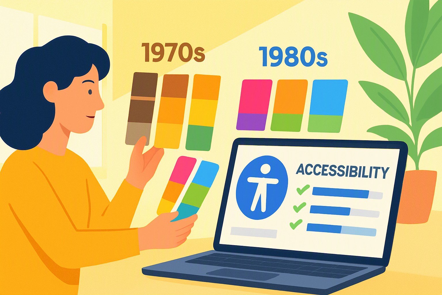
The best retro palette for a modern website balances 1970s or 1980s nostalgia with strict WCAG contrast standards, ensuring high readability without sacrificing vintage aesthetic appeal. Achieving this requires adjusting hue saturation and luminance values before deploying custom style sheets to live servers.
How Do Retro Palettes Affect Usability and Metrics?
Vintage color selections directly impact user engagement and bounce rates. When visitors encounter unexpected color combinations, they spend extra time decoding the historical styling. Establishing a clear visual hierarchy relies heavily on contrast.
According to research published by the Nielsen Norman Group, users judge visual appeal within 50 milliseconds, and high aesthetic variation directly influences perceived trustworthiness. When building out your design framework, foundational decisions should align with the core principles discussed in our guide to building a color concept.
If historical tones clash with modern readability expectations, users abandon the page before interacting with conversion elements.
Which Retro Color Schemes Perform Best in Modern Testing?
| Retro Era | Primary Hue Profile | WCAG Compliance Level | Best Use Case on Modern Sites |
|---|---|---|---|
| 1970s Earth Tones | Mustard yellow, burnt orange, avocado | Moderate to High | Editorial blogs, artisanal e-commerce |
| 1980s Neon Palettes | Hot pink, electric cyan, acid green | Low (Requires modification) | Call-to-action buttons, hero accents |
| 1990s Grunge | Muted olive, slate grey, deep maroon | High | Portfolio sites, long-form publishing |
Evaluating contrast ratios for text readability under Web Content Accessibility Guidelines (WCAG) ensures that historical palettes do not exclude users with visual impairments. For instance, pairing a 1970s avocado green background with white text often fails standard contrast minimums, requiring a darker shade adjustment. Designers looking to implement complex palettes can review strategies for managing intricate color sets through our multi-category data color guide to maintain structure without hurting user retention.
How Can You Optimize Vintage Design Choices for Search Visibility?
Loading uncompressed raster images to achieve a vintage grain or textured background destroys page speed, which ultimately harms search authority and historical rankings. Clean CSS implementation prevents heavy assets from slowing down historical design themes.
Platforms like Color Fiind Bloggerr track the evolution of web design trends, noting that modern search crawlers prioritize fast rendering over stylistic flourishes. When structuring complex data displays within a nostalgic theme, developers must avoid bloated DOM elements. Utilizing lightweight vector components mirrors the optimization strategies detailed in our network graph color guide, ensuring fast load times.
What Are the Common Pitfalls When Implementing Vintage Styles?
Low-contrast retro color choices create accessibility failures, locking out users who rely on screen magnifiers or high-contrast display modes. Mobile responsiveness presents another hurdle when pairing muted vintage palettes with small screens, as low-luminance text washes out entirely under direct sunlight.
To maintain distinct brand identity while using nostalgic hues, apply bright vintage accents strictly to non-text elements while keeping body copy neutral. According to the World Wide Web Consortium, normal text requires a minimum contrast ratio of 4.5:1 against its background. Testing your final layouts across various viewports ensures your vintage design remains universally accessible.

Frequently asked questions
Do retro color palettes hurt website loading speeds?
No, the color choices themselves have zero impact on file size or loading speeds. Performance issues only arise if you use unoptimized raster background images instead of clean CSS gradients and vector graphics.
How do I ensure my vintage color scheme meets accessibility standards?
You must test every text and background color combination to achieve a minimum contrast ratio of 4.5:1 for normal text. Tools like the WebAIM Contrast Checker can verify whether your nostalgic hues meet legal accessibility requirements.
Can I use bright 1980s neon colors for body text?
Using high-saturation neon colors for long blocks of body text causes severe eye strain and poor readability. Reserve bright neon shades strictly for accents, call-to-action buttons, and decorative graphic headers.


Comments
Post a Comment