Network Graph Visualization Color: Best Practices and Palettes
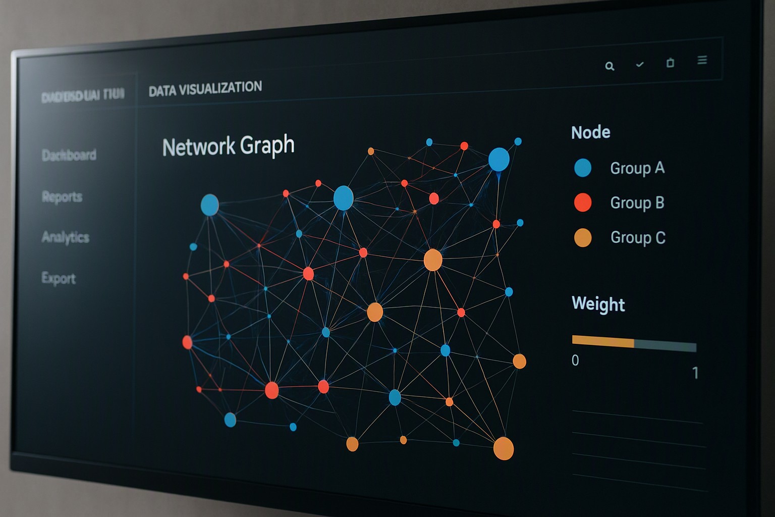
Network graph visualization color choices rely on assigning distinct hues to categorical clusters while using lightness and saturation for quantitative weights. Visual encodings turn messy data into clear structures.
Why Does Network Graph Visualization Color Matter?
Color reduces visual clutter in dense node-and-edge webs by establishing immediate hierarchy and grouping related entities. Thousands of overlapping connections create a visual bottleneck. Unstyled gray circles fail. Human working memory limits pattern recognition to roughly four to seven distinct visual objects at a glance. Chaotic palettes trigger cognitive fatigue instantly.
According to the Web Content Accessibility Guidelines, relying on color alone without luminance or pattern differentiation alienates users and violates basic perceptual standards.
How Do You Choose Categorical Colors for Disconnected Nodes?
Assigning distinct hues to unrelated groups requires strict limits to prevent visual chaos. Human physiological perception struggles to reliably differentiate more than seven categorical groups simultaneously on a single screen.
Complex datasets benefit from the foundational ideas outlined in our guide to legend design. Designers map categorical distinctions across tools like Gephi, D3.js, or Cytoscape using insights from creative color theory fundamentals.
When Should You Use Sequential versus Diverging Colors for Weights?
Sequential palettes suit positive linear metrics where values progress from low to high. Diverging palettes serve data with a meaningful median or zero point. Choosing the wrong scale hides critical anomalies, much like the regional distortion risks explored in our analysis of election data maps.
| Palette Type | Best Use Case | Metric Characteristics | Example Application |
|---|---|---|---|
| Categorical | Unrelated groups or clusters | Discrete, non-numeric categories | Department tags, user types |
| Sequential | Quantitative magnitude | Positive linear values (0 to 100) | Transaction volume, connection count |
| Diverging | Spectrum analysis | Bipolar data with a true center | Sentiment analysis (-1 to +1), profit/loss |
Metric mapping practices align with broader dashboard design principles, reinforcing the lessons found in our Sankey diagram system guide.
How Do You Style Edges Without Causing Visual Noise?
Edges require careful styling through source-to-target gradients and weight-based opacity. Solid black lines fail in dense networks because they obscure underlying node clusters. Muted gray tones or translucent links improve clarity. Teams test how line thickness interacts with background contrast using resources hosted on Color Fiind Bloggerr.
What Are the Accessibility Pitfalls in Graph Design?
Red-green colorblindness affects approximately 8 percent of men and 0.5 percent of women. Traditional red and green node clusters remain invisible to this audience. Designers utilize color pickers and luminance simulators to verify that contrast ratios meet minimum thresholds. Combining color changes with distinct node shapes or patterns ensures clarity, a technique detailed in tutorials on extracting palettes from images.

Frequently asked questions
How many colors should I use in a network graph?
Limit categorical colors to a maximum of six or seven distinct hues. Group minor categories into an 'other' bucket or rely on interactive tooltips if your graph contains more groups.
Should edge colors match node colors?
Edges inherit the color of their source node or use a neutral gray gradient. Matching every edge directly to its connected nodes creates chaotic visual noise.
How do I make my network graphs accessible to colorblind users?
Avoid relying solely on red-green contrasts. Combine color changes with varying node shapes, sizes, or direct text labels, and test palettes using colorblind simulation tools.


Comments
Post a Comment