Minimal or Bold Neon Palette: Which Fits Your Design Better?
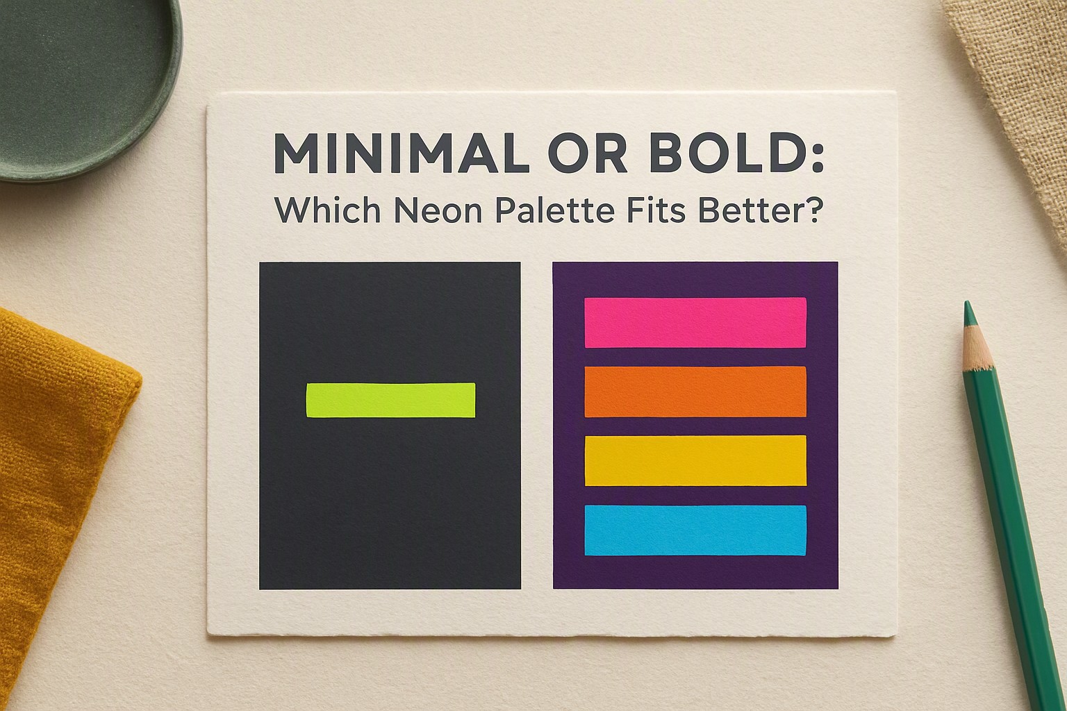
The quick answer is that minimal neon palettes prioritize targeted focus and restraint using single accent highlights, whereas bold neon palettes maximize emotional impact through high-saturation floods. Choosing between them depends entirely on whether your user needs sustained readability or immediate visual excitement.
Working with fluorescent colors requires strict discipline. Designers often default to maximum brightness across every element, creating visual chaos that ruins usability.
Core Differences Between Minimal and Bold Neon Palettes
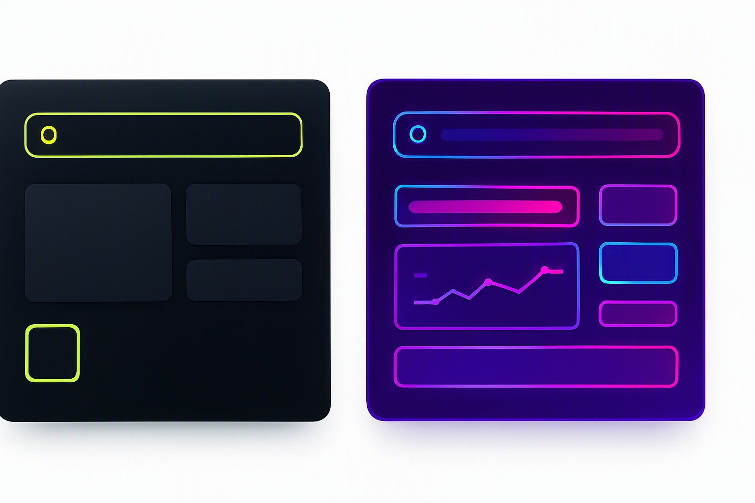
Minimal design relies on functional restraint. Instead of flooding an interface with electric pinks and toxic greens, a restrained approach uses a single fluorescent highlight against a neutral background. Bold neon palettes, conversely, embrace high-saturation floods across multiple structural elements to create immersive, high-energy environments. Designers evaluating these options can review successful patterns in top neon palettes for UI design to understand how layout density changes the required color weight.
| Attribute | Minimal Neon Palette | Bold Neon Palette |
|---|---|---|
| Contrast Ratios | High local contrast on specific interactive targets | High global contrast across entire backgrounds and components |
| Visual Weight | Low overall weight with high-impact focal points | Heavy, immersive weight that dominates the view |
| Cognitive Load | Low; reduces distraction and eye strain | High; demands active visual processing |
| Ideal Use Cases | Productivity apps, long-form dashboards, developer tools | Gaming platforms, marketing landing pages, entertainment portfolios |
Impact on User Focus and Visual Hierarchy
Restricting a color palette prevents cognitive fatigue in digital interfaces by giving the human eye clear areas of rest. When building minimal sets, designers must ensure that high-saturation accents meet strict legibility thresholds.
According to the Web Content Accessibility Guidelines (WCAG) contrast minimum specification, normal text must maintain a contrast ratio of at least 4.5:1 against its background. Fluorescent colors frequently fail this test when placed on mid-tone or improperly shaded backdrops.
Selecting Minimal Warm Palettes Versus Cold Neon Tones
Selecting a minimal warm palette introduces inviting amber, coral, or fiery magenta accents that feel approachable compared to sterile electric blues. Cold neon tones often trigger an artificial, clinical atmosphere, whereas warm fluorescent hues foster energetic engagement without alienating the user.
Developers can fine-tune these hue temperatures using a color swatch tool to test exact hex values. For projects balancing between fiery tones and icy hues, analyzing an Electric Blue vs Hot Pink Neon Palette clarifies how temperature shifts alter perceived brand personality.
Practical Limitations of Adopting a Minimal Bold Approach
Combining ultra-bright accents with dark backgrounds introduces severe accessibility bottlenecks, particularly for users with astigmatism or light sensitivity. Furthermore, enforcing a strict minimal minimum color rule carries a distinct risk of brand dilution or sterile aesthetics, leaving interfaces looking like unstyled wireframes rather than finished products.
Investigators studying typography legibility note that glowing halos around saturated text reduce character recognition speed in low-light environments. Designers can avoid these pitfalls by auditing existing competitor implementations, similar to the techniques outlined in the Color Fiind Bloggerr breakdown of modern web structures.
Frequently asked questions
Are neon color palettes suitable for long-form reading interfaces?
Saturated neon colors cause severe eye fatigue when applied to large blocks of text or primary background surfaces. Reserve them for micro-interactions, call-to-action buttons, and focal data points.
How many colors should be included in a balanced neon color scheme?
A successful neon palette relies on one dominant neutral, one secondary structural tone, and a single vibrant neon accent. Exceeding three active colors creates visual clutter.
Do dark backgrounds work better with neon color combinations?
Dark backgrounds naturally enhance the perceived luminosity of neon hues, making them appear to glow. Designers must still verify that text elements meet minimum contrast thresholds for readability.


Comments
Post a Comment