Treemap Color Systems for Many Categories: Best Practices
Treemap color systems for many categories require balancing distinct hues with hierarchical luminance controls, as human visual memory typically caps out at distinguishing seven unique colors simultaneously without a supporting legend or interactive grouping.
Core challenges of treemap color systems for many categories
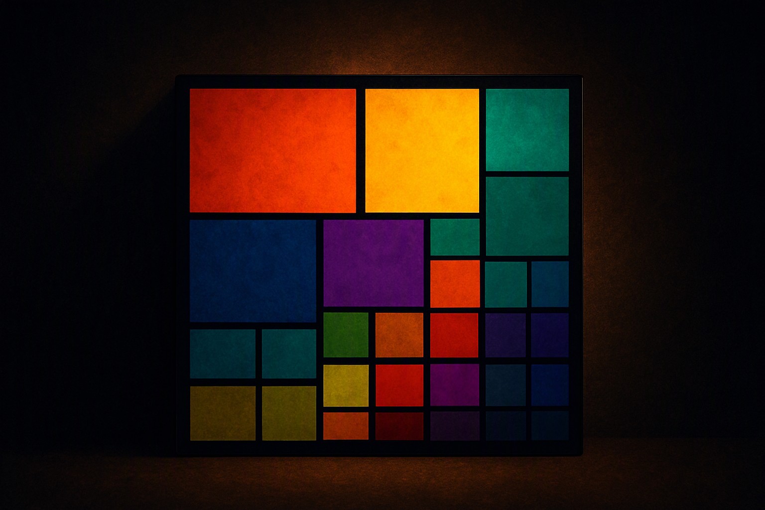
The human eye struggles to distinguish more than 6 to 8 distinct hues at once when placed in dense visual arrangements. Developers frequently run into visual clutter. Hierarchical nesting further complicates category distinction in dense layouts because smaller sub-rectangles inherit surrounding background noise, causing colors to vibrate or disappear.
Managing this density requires robust foundational rules, similar to the strategies discussed in Color Fiind Bloggerr when handling complex time-series color shifts. Without strict organization, a dashboard tracking 30 different product categories becomes completely unreadable.
Structuring categorical color palettes for readability
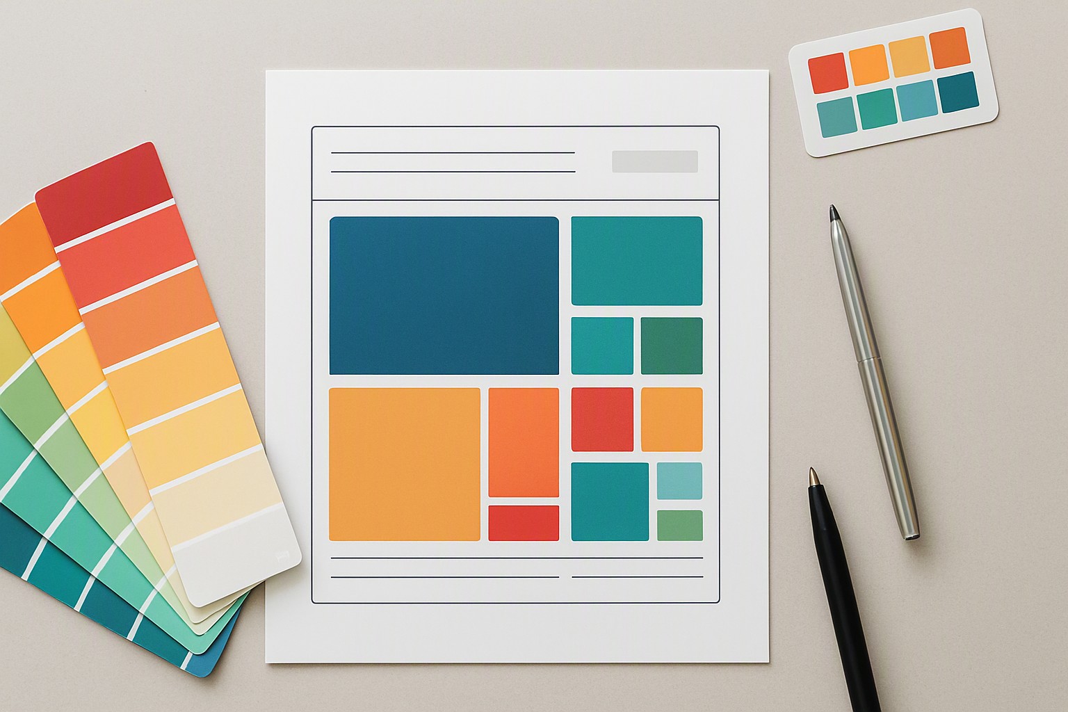
Structuring complex charts involves grouping related categories using parent-child luminance variations rather than assigning a random hue to every single data point. Establishing a clear visual hierarchy prevents cognitive overload.
| Palette Type | Scannability | Accessibility | Category Capacity | Best Use Case |
|---|---|---|---|---|
| Flat Rainbow Palette | Low | Poor | 5–8 hues max | Simple, low-density charts |
| Semantic Grouped Palette | High | Good | 15–30 categories | Hierarchical dashboards |
| Neutral-with-Accent System | High | Excellent | 30+ categories | Large enterprise analytics |
When implementing these choices in production code, developers must verify that foreground and background elements meet strict contrast standards. According to the Web Content Accessibility Guidelines (https://www.w3.org/WAI/standards-guidelines/wcag/), normal text requires a minimum contrast ratio of 4.5:1 against its background. Developers often pair these color tokens with rules outlined in our guide to matching colors and apply them using modern color swatches in design systems.
Luminance and saturation tuning for dense layouts
Shifting saturation prevents heavily saturated colors from overwhelming smaller blocks in a treemap. If every category uses maximum saturation, small data nodes grab disproportionate visual weight, misleading users into thinking minor metrics are critical. This rectangle sizing principle directly mirrors the spatial density constraints found in geospatial mapping design, as explored in our geospatial palette guide.
Designers must also consult established UI principles such as those found in mastering data visualization legends to keep complex dashboards legible across varying screen sizes.
Transitioning from pure color maps to interactive highlighting
When a dataset exceeds twenty distinct categories, relying entirely on static color differentiation fails. Hover states and tooltips reduce reliance on memorizing 20 distinct hues by dimming inactive regions and isolating the active data branch. Building this behavior in a React or Vue web application running on US servers requires clear state management for mouse events.
Static print distribution demands high-contrast, limited palettes because interactive tooltips cannot function on paper. Dynamic web dashboards thrive on progressive disclosure patterns, similar to the interactive flow techniques detailed in our sankey diagram guide.
Frequently asked questions
How many categories can a treemap realistically display with unique colors?
Most data visualization experts recommend limiting unique hues to seven or eight. If you have dozens of categories, you must group them into parent hierarchies or rely on neutral shades with targeted accent colors.
Should I use a rainbow color scale for categorical treemaps?
No. Rainbow scales introduce artificial luminance gradients that mislead viewers into thinking differences in color brightness represent differences in data magnitude. Use a qualitative palette with uniform perceived brightness.
How do I make treemaps accessible for color-blind users?
Incorporate secondary visual encodings such as distinct textural patterns, clear boundary strokes, or direct text labels inside the larger rectangles. Test your final palette against deuteranopia and protanopia simulators.


Comments
Post a Comment