Scatterplot Color Systems for Multiple Dimensions Explained
Scatterplot color systems for multiple dimensions assign distinct hues, saturations, or luminance steps to data points, allowing analysts to track three or more variables at once across a two-dimensional grid.
How do you encode multiple dimensions in a scatterplot using color?
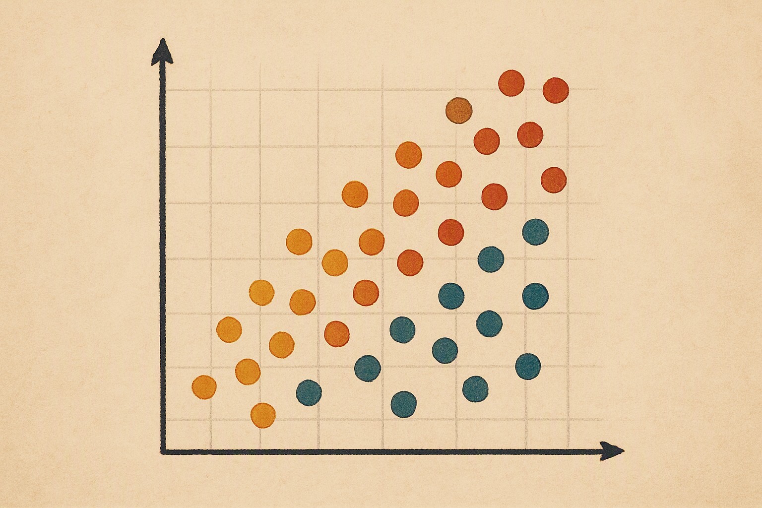
Mapping extra variables onto a two-dimensional plot requires expanding visual channels without overwhelming human perception. The primary method binds a third variable to hue and a fourth to luminance or saturation. For example, a scatterplot tracking customer age on the X-axis and income on the Y-axis can map purchase frequency to hue and customer lifetime value to luminance. Consult mastering the data visualization legend to keep reference keys clear as dimensions multiply.
Vision has limits.
Most viewers struggle to distinguish more than five or six distinct hues simultaneously when points cluster tightly together without clear separation. To prevent visual clutter, combine color with secondary visual encodings like marker shape or size.
Scaling down marker size for minor categories leaves room for hue distinctions on primary data points. This technique mirrors the visual density management used in multi-category time-series color systems.

When should you use categorical versus continuous color scales?
Choose your palette structure based on whether the additional variable contains discrete groups or continuous numerical values. Categorical palettes assign distinct, unrelated hues to qualitative divisions like geographic regions or product categories. Continuous variables require sequential or diverging gradients that display steady numeric rank or deviation from a central midpoint. Learning how to match colors harmoniously ensures neighboring markers do not clash visually.
Linear color scales fail when applied to skewed distributions.
When data values spike exponentially, linear gradients compress the vast majority of points into a single muddy shade while reserving distinct colors only for extreme outliers.
| Color System Type | Data Type | Max Distinct Levels | Perceptual Distortion Risks |
|---|---|---|---|
| Categorical | Qualitative / Discrete | 4 to 6 categories | High risk of category confusion when hues sit close on the color wheel. |
| Sequential | Quantitative / Ordered | 7 to 9 steps | Pale low values wash out entirely against light backgrounds. |
| Diverging | Quantitative with Midpoint | 7 to 11 steps | Uncalibrated neutral midpoints conceal meaningful clusters and anomalies. |
What are the accessibility challenges in multi-dimensional color systems?
Color vision deficiency affects approximately 8% of men and 0.5% of women worldwide, making scatterplots that rely strictly on red-green hue pairs unreadable. Deuteranopia and protanopia flatten the visual boundary between these clusters, turning complex multi-variable correlations into visual noise. Blue-orange and purple-green palettes preserve these boundaries across different forms of colorblindness.
Contrast matters everywhere.
According to the Web Content Accessibility Guidelines, non-text graphical elements require a contrast ratio of at least 3:1 against adjacent colors and the chart background.
How do you handle overlapping points and dense data clusters?
Dense clusters of overlapping markers obscure individual values and hide sample distribution. Alpha blending solves this by making individual points semi-transparent. As semi-transparent points stack, high-density coordinates naturally darken and reveal distribution clusters without requiring separate contour overlays.
Transparency brings trade-offs.
Review bubble chart colors for overlapping points to calibrate alpha thresholds against point density. When semi-transparent markers overlap, their colors blend additively or subtractively, creating false intermediate hues that viewers mistake for independent categories.
Frequently asked questions
How many dimensions can a single scatterplot effectively display using color?
A scatterplot can clearly display one additional dimension using categorical color hues, and up to two if combining hue with luminance or saturation steps. Including more than four total variables across axes, hues, and brightness leads to cognitive overload and misinterpretation.
Why do overlapping points distort color perception in scatterplots?
When semi-transparent points overlap, their color values blend and produce intermediate shades that do not belong to the original palette. Viewers often interpret these combined colors as separate categorical groups or misread their true density values.
How do you choose color palettes for printing data visualizations in grayscale?
Scatterplots intended for monochrome printing must encode data through distinct luminance steps rather than hue differences alone. Converting a palette to pure grayscale confirms whether adjacent data points remain distinguishable by brightness contrast.


Comments
Post a Comment