Mist Blue vs Soft Grey for Light Design: Which to Choose?
Mist blue provides a calming chromatic undertone with a subtle cyan hint. Soft grey operates as a true achromatic neutral. Mist blue suits spaces needing gentle warmth. Soft grey fits stark, modern minimalism.
This guide examines how pale chromatic tints interact with architectural illumination and digital interfaces. Understanding these interactions builds upon foundational concepts explored when selecting a White vs Ivory Light Palette for residential or commercial spaces.
Core differences between mist blue and soft grey
Mist blue is a pale chromatic paint tint. It mixes low-saturation blue and green pigments in a white base. Soft grey is an achromatic neutral. It mixes precise ratios of black and white pigment without a dominant hue bias. Under standardized neutral 5000K illumination, mist blue reflects a quiet sky-like coolness. Soft grey reads as a flat, balanced middle ground.
Cool-tinted neutrals absorb slightly more red and yellow spectrum light. Muted blue chromatic hues bounce short-wavelength light into a room, shifting perceived space temperature.
| Property | Mist Blue | Soft Grey |
|---|---|---|
| Light Reflectance Value (LRV) | Typically 68 to 75 | Typically 65 to 72 |
| Emotional Response | Serene, airy, organic | Neutral, grounding, professional |
| Undertone Variance | Subtle cyan or green hints | Pure neutral or slight violet/warm taupe |
| Best-Use Application | Living rooms, bedrooms, UI backgrounds | Modern minimalist architecture, office spaces |
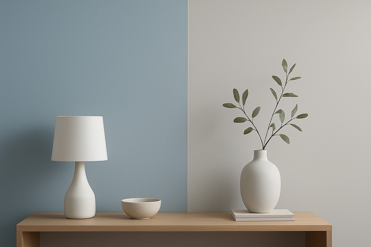
Valspar blue mist formulations in different lighting conditions
Commercial paint options like valspar blue mist use specific resin and titanium dioxide formulas. These formulas alter how light disperses across textured walls. Choosing a blue mist valspar formula requires evaluating room orientation. Natural daylight changes how these coatings look. North-facing rooms supply cold, bluish natural light. This light pushes blue mist color hues toward an icy periwinkle. South-facing rooms flood interiors with warm golden light. This warmth neutralizes the cool edge and pulls out a muted slate character.
Official pigment dispersion standards from major coatings manufacturers state that high titanium dioxide loads increase hiding power. They can also flatten subtle chromatic shifts under direct sunlight. When matching digital equivalents, an accurate RGB to Hex Color Converter helps bridge physical paint chips with screen representations.
Choosing mist blue paint over traditional neutrals
Residential designers select mist blue paint when an interior needs personality beyond a standard neutral. This pale shade creates an inviting atmosphere in bedrooms and sunrooms by mimicking atmospheric haze. Digital interface designers apply muted cyan-blues to UI backgrounds. This mirrors structural choices found in Top Light Palettes for web design where readability and calm user experiences take priority.
Pitfalls exist. High-Kelvin LED sources exceeding 4000K make mist blue paint look clinical, sterile, or institutional.
Blue mist paint compared to other cool accents
Contrasting blue mist paint with deeper chromatic alternatives highlights its role as a quiet background tint. Pairing these soft shades with warm walnut wood finishes, unlacquered brass hardware, or dark charcoal accents grounds wall lightness. Accessibility standards from the World Wide Web Consortium (W3C) demand sufficiently dark foreground text to maintain minimum contrast ratios for visual accessibility.
For bolder digital explorations, pairing pale architectural tints with high-impact elements mirrors techniques found when balancing an Electric Blue vs Hot Pink Neon Palette in contemporary design systems.
Frequently asked questions
Does mist blue look too childish or nursery-like on large walls?
When chosen with grey or green undertones rather than high saturation, mist blue reads as sophisticated and neutral. Testing a physical swatch on all four walls for 48 hours prevents unexpected bright blue surprises.
What trim colors work best with soft grey and mist blue walls?
Crisp, clean ultra-white trim provides sharp modern contrast. Creamy off-whites soften the overall look and bridge cool wall colors with warm flooring materials.
How do artificial lighting Kelvin ratings affect these colors?
Warm LED bulbs around 2700K neutralize the coolness of both shades. Cool white bulbs above 4000K pull out icy, stark undertones that can make a room feel uninviting.
Can I use mist blue and soft grey together in the same color scheme?
Yes. Because mist blue is effectively a tinted grey, they harmonize effortlessly. Use soft grey for large architectural zones and mist blue on focal walls or cabinetry for subtle depth.


Comments
Post a Comment