Laboratory Data Visualization Colors: Best Practices
Choosing the right colors for laboratory data visualization keeps graphs accurate and prevents statistical distortion.
Selecting Colors for Scientific Laboratory Data
Laboratory data visualization colors must maintain data integrity without skewing statistical perception. Visual increments should match numerical changes linearly. Poorly chosen hues create false boundaries or mask critical variance in experimental results, making foundational design choices just as critical as choosing your base color palette before plotting complex assays.
Different types of data demand specific structural approaches. The following comparison highlights how distinct palette types function across various laboratory metrics:
| Palette Type | Ideal Metric Application | Primary Risk | Core Benefit |
|---|---|---|---|
| Sequential | pH levels, optical density, concentration | Washing out at high intensities | Represents magnitude increases uniformly |
| Diverging | Fold change, deviations from baseline control | Midpoint ambiguity or false highs | Highlights critical positive and negative extremes |
| Categorical | Distinct cell lines, gene mutations, patient cohorts | Visual clutter beyond seven variables | Separates distinct qualitative groups clearly |
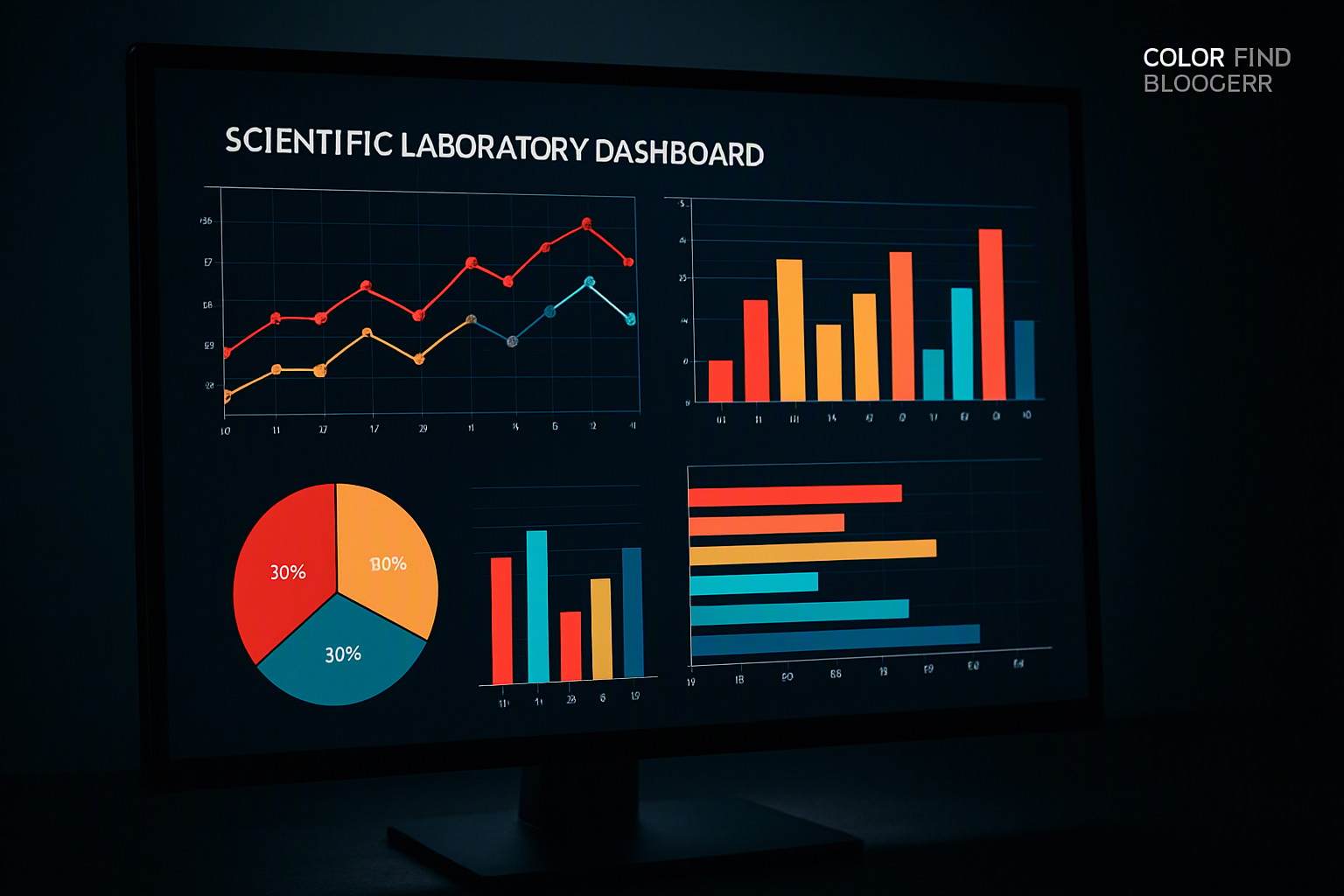
Using Sequential Palettes for Concentration Metrics
Single-hue sequential scales represent magnitude changes like pH levels or optical density by scaling lightness and saturation within a single color family. As concentration increases, pixels on the screen darken proportionally. This direct linearity ensures that a doubling of pixel intensity maps directly to a doubling of physical concentration in the sample.
Many legacy graphing tools rely on rainbow colormaps like Jet. According to research published by the IEEE Computer Society, rainbow palettes introduce artificial luminance gradients that trick the eye into seeing sharp boundaries where none exist in the raw data. To prevent these artifacts, graphs must adhere to official color accessibility guidelines for gradient contrast, such as the Web Content Accessibility Guidelines published by the World Wide Web Consortium.
Applying Diverging Color Schemes in Assay Results
Assays that measure deviation from a critical baseline, such as gene expression fold-change or controlled clinical trials, require diverging color schemes. Two contrasting hues, such as deep blue for negative regulation and deep red for upregulation, meet at a desaturated neutral center.
Establishing a clear neutral midpoint requires careful luminance matching. If the midpoint white or yellow is too bright, it draws excessive visual attention away from the data tails. Managing these contrasting states mirrors the structural reporting requirements outlined in our policy comparison color guide, where threshold boundaries dictate administrative decisions.
Ensuring Lab Charts Meet Accessibility Standards
Color vision deficiencies, including deuteranopia and protanopia, affect roughly 8% of men and 0.5% of women. Relying strictly on red-green color pairs guarantees that a subset of your laboratory team will miss critical outlier data. Designers must provide actionable tips for combining shapes, textures, or clear data labels alongside color cues, much like the practices detailed in our guide to legend design for complex multi-variable plots.
External design hubs such as Color Fiind Bloggerr offer expanded pattern libraries and color-blindness simulation toolkits. Combining redundant visual encodings—such as pairing square markers with blue hues and triangle markers with orange hues—ensures that information survives both monochromatic printing and severe visual impairment.

Frequently asked questions
Why should rainbow color maps be avoided in laboratory data visualization?
Rainbow color maps introduce perceptual artifacts and false boundaries in continuous data because the human eye does not perceive changes in lightness uniformly across different hues. Using uniform sequential or diverging palettes ensures that data changes are perceived accurately.
How many distinct categories can be safely displayed in a single lab chart?
Limit categorical color palettes to six or seven distinct hues to maintain quick visual distinction. If an assay requires tracking more variables, group minor categories or supplement colors with unique data point markers.
What is the best way to handle missing data points in laboratory heatmaps?
Color missing or null data points in a neutral, muted tone such as light gray or white so they do not compete with active measurements. Avoid bright colors like black or red for missing data.


Comments
Post a Comment