How Food Logo Color Psychology Drives Consumer Choices
Food logo color psychology is the strategic use of specific hues to trigger subconscious emotional and physiological responses that drive consumer appetite and purchasing decisions.
What colors actually stimulate appetite in food branding?
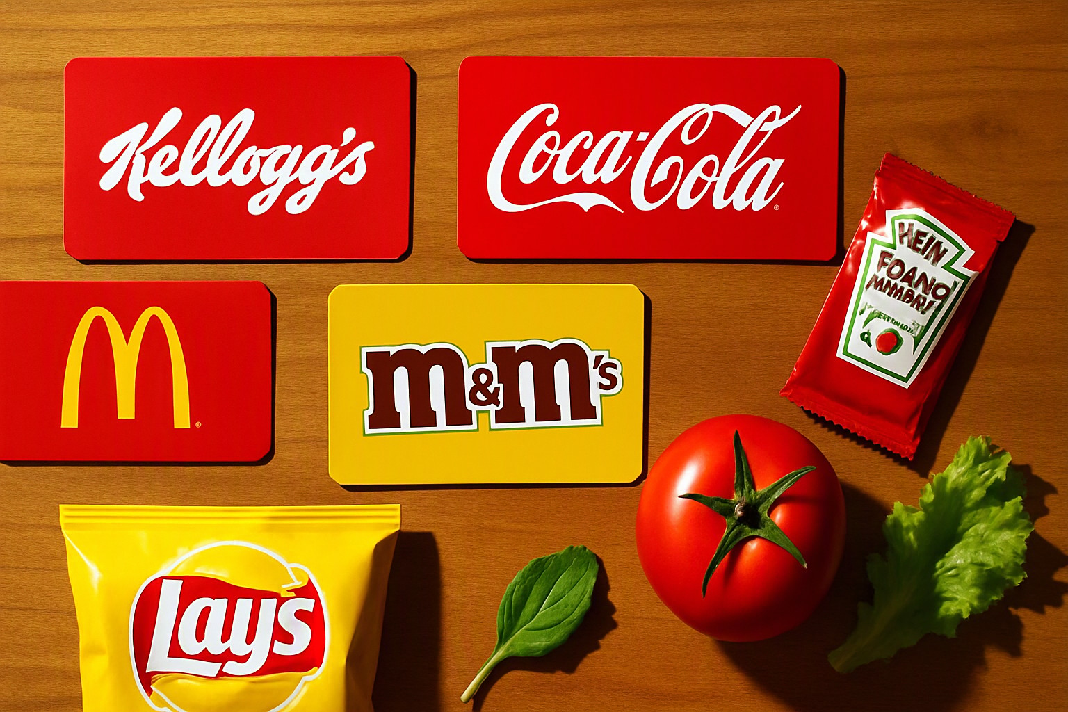
Red, yellow, and orange dominate fast food and snack branding. They trigger physiological responses like increased heart rate and perceived urgency. High-arousal warm colors accelerate metabolic rates. Consumers feel physically hungrier. Fast decisions happen. Global chains rely on these warm hues.
When developing a cohesive identity, expanding beyond single primaries requires examining brand color palette examples to see how chromatic emotional triggers scale across menus, signage, and merchandise at Color Fiind Bloggerr.
| Color Category | Primary Hues | Physiological & Psychological Association | Common Industry Application |
|---|---|---|---|
| Warm Stimulants | Red, Yellow, Orange | Increases heart rate, signals urgency, triggers appetite | Fast food chains, snack foods, casual dining |
| Cool Tones | Blue, Green | Lowers heart rate, calmness, nature, purity | Health foods, organic produce, dairy, bottled water |
| Earth Tones | Brown, Beige, Terracotta | Conveys warmth, earthiness, tradition, wholesomeness | Bakeries, coffee shops, artisanal goods |
Why do health and organic brands rely on green and earth tones?
Green signals freshness, nature, and organic origin. It is the default choice for health foods, salads, and plant-based substitutes. Consumers associate the wavelength of green with edible foliage and safe foraging environments. This builds immediate trust for clean-label products. In sweet categories, green signals spoilage, unripe fruit, or artificial sourness.
Balancing these undertones requires careful planning, especially when how to choose which color matches dictates whether a brand identity feels genuinely nourishing or unpalatably medicinal.
How does blue communicate trust and purity in food packaging?
Blue is exceptionally rare in natural foods. Yet it dominates bottled water, dairy items, and low-calorie products to denote cleanliness and hydration. Human psychology historically associates blue with non-toxic, safe hydration sources like clean water and clear skies. Because blue suppresses human appetite compared to warm alternatives, food brands restrict its application to products where purity, refreshment, and trust outweigh immediate hunger induction.
Pairing a dominant blue packaging strategy with a neutral vs bright palette ensures that secondary elements do not overwhelm the clean, clinical aesthetic required for dairy and functional beverages.
What role do contrast and background colors play on supermarket shelves?
High visual contrast helps packaging stand out in cluttered retail environments under fluorescent supermarket lighting. Human retinas lock onto sudden shifts in chromatic contrast within milliseconds of scanning a shelf array. Sharp complementary contrasts capture fleeting consumer attention.
Applying these shelf-impact principles mirrors the structural rules found in color in UI design, where guiding user focus depends entirely on disciplined luminance and saturation hierarchies.
Frequently asked questions
Why do most fast-food chains use red and yellow?
Fast-food chains use red and yellow because these warm hues accelerate metabolic rates and trigger a sense of urgency, which encourages consumers to eat faster and purchase items quickly.
Is blue ever used for food logos?
Blue is rarely used for direct food items because few natural foods are blue and the color suppresses appetite, but it is standard for bottled water, dairy, and diet products to communicate purity and trust.
How do cultural differences affect food branding colors?
Color meanings change across global markets; for example, white symbolizes purity in Western cultures while representing mourning in specific Asian cultures, requiring brands to adapt their palettes during international expansion.


Comments
Post a Comment