Choosing the Best Neon Mix Color Background for Your Project
A successful neon mix color background relies on pairing high-luminance fluorescent hues with deep, desaturated neutral bases or dark charcoal tones to ensure absolute legibility and prevent visual fatigue. Without careful luminance balancing, intense fluorescent saturation washes out typography and triggers rapid eye strain across standard digital displays.
How Do You Balance a Neon Mix Color Background Without Hurting Readability?
Proportion matters. The 60-30-10 rule applied specifically to high-saturation fluorescent palettes dictates that 60% of the viewport consists of a dark or muted neutral background, 30% supports structural UI containers or typography, and only 10% is reserved for high-energy fluorescent accents. According to the Web Content Accessibility Guidelines (https://www.w3.org/WAI/WCAG21/Understanding/contrast-minimum.html), body text must achieve a minimum contrast ratio of 4.5:1 against its immediate background.
Grounding vibrant hues with muted neutrals prevents the luminous frequencies from vibrating against each other. Further structural layout examples are available within our guide to top neon palettes for ui design.

Which Electric Blue vs Hot Pink Neon Palette Combinations Work Best?
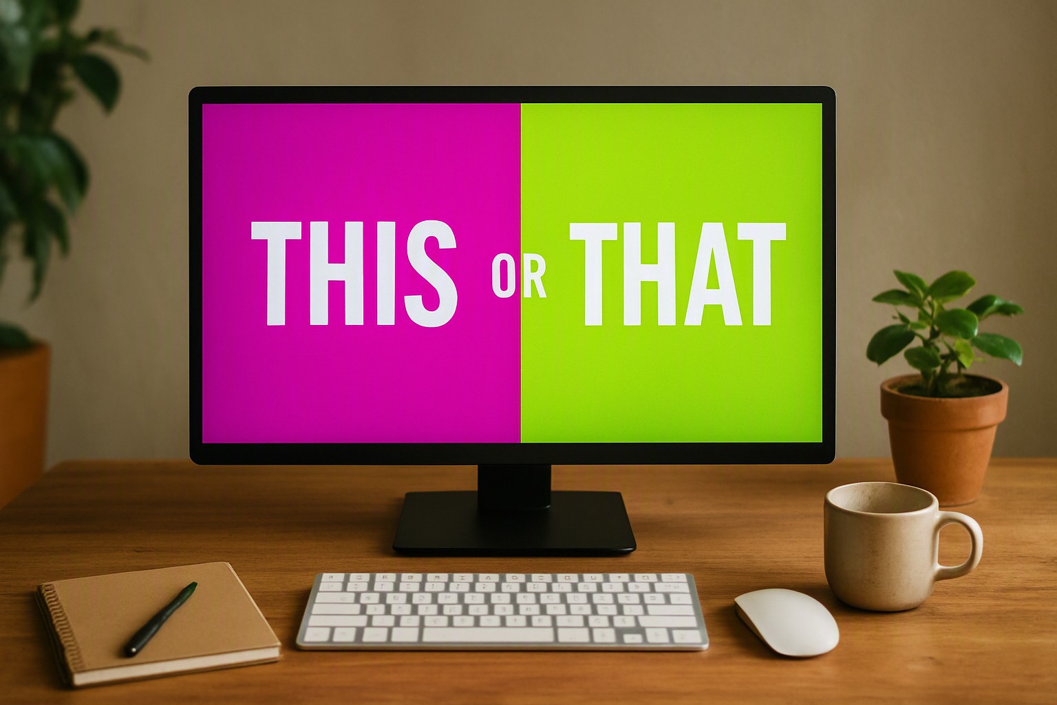
High-energy cyan and magenta tones generate intense visual tension because they sit on opposite sides of the RGB digital spectrum. When placed side by side, their high luminance creates an optical vibration that tires the human eye within seconds.
Separate them. Use deep charcoal blocks or dark navy structural borders between the two hues to stop the eye strain.
For optimal digital screen rendering, electric cyan should be kept within the hex range `#00f3ff` to `#00b8ff`, while hot pink performs best between `#ff007f` and `#ff2a85`. Companion styling approaches detailed in electric blue vs hot pink neon palette breakdowns show that desaturating one hue while keeping the other at full intensity resolves contrast failure.
Should You Choose Light vs Dark Neon Color Combinations for Your Layout?
Selecting between absolute black backdrops and blinding white or light gray surfaces fundamentally changes how fluorescent pigments register on the human retina. Stark black backdrops (`#0a0a0a`) maximize the perceived luminance of neon pigments, allowing lower power consumption on OLED screens while sharpening edge definition. Conversely, light gray or stark white surfaces hosting neon elements often wash out fluorescent values unless paired with dark drop shadows or thick outlines.
Eye strain and retinal fatigue manifest differently across dark mode versus light mode implementations, with light mode neon causing harsher afterimages during prolonged reading sessions. Incorporating insights from light vs dark neon color combinations guides helps teams align their surface choices with user viewing habits.
How Do Popular Neon Mix Color Background Styles Compare?
| Style Tier | Readability | Visual Impact | Primary Use Case |
|---|---|---|---|
| Dark Mode Neon | High (with dark neutral base) | Maximum | Developer portfolios, cyberpunk UI |
| Light Neon | Low to Moderate | High | Marketing landing pages, event posters |
| Gradient Neon | Moderate | High | Hero section banners, branding splash screens |
| Minimal Neutral Neon | Maximum | Balanced | SaaS dashboards, typography-heavy web apps |
By restricting neon colors to micro-interactions, badges, and focus rings, designers maintain WCAG compliance while preserving the energetic aesthetic of fluorescent design.
What Are the Most Common Mistakes When Pairing Neon Backgrounds?
One of the most frequent technical errors is simultaneous contrast, a phenomenon where vibrating boundaries cause text to blur and become unreadable. Oversaturating every single UI element destroys visual hierarchy because no single focal point remains for the user's eye to anchor onto. According to research standards on chromatic aberration from the Interaction Design Foundation, extreme shifts in wavelength—such as placing saturated red text directly on a vibrant blue background—cause the eye's lens to focus different wavelengths at different planes, resulting in severe optical blurring. Avoiding these pitfalls requires rigorous contrast testing, a practice highlighted in top neon color combinations every designer should try.
Frequently asked questions
Are neon background color combinations safe for users with visual impairments?
Pure neon colors fail standard contrast checks when placed against inappropriate backgrounds. Designers must test luminance levels rigorously to comply with minimum accessibility ratios, usually by pairing bright fluorescents with near-black or deep navy backdrops.
How do I stop neon colors from vibrating against each other?
Vibrating boundaries happen when two highly saturated colors of similar value are placed directly side by side. You can fix this by introducing a dark or desaturated border, adding drop shadows, or adjusting the brightness value of one color so it clearly dominates.
Can I use a neon background color combination for corporate branding?
Yes. It requires restraint and works best for tech startups, creative portfolios, or modern digital products. Limiting neon to accent elements or subtle background gradients prevents the brand identity from feeling overwhelmingly chaotic.


Comments
Post a Comment